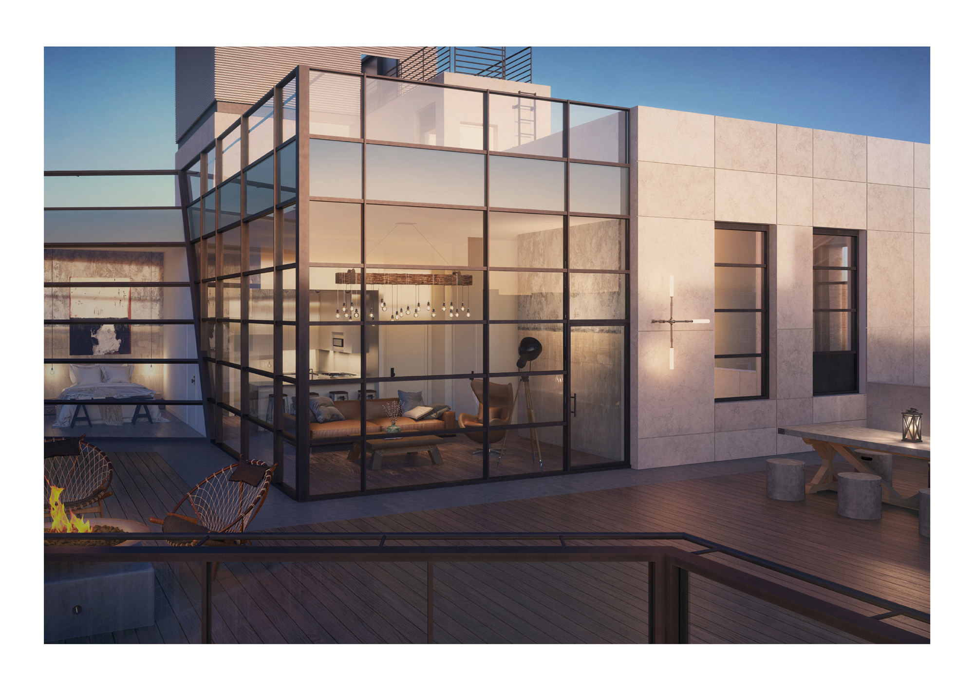
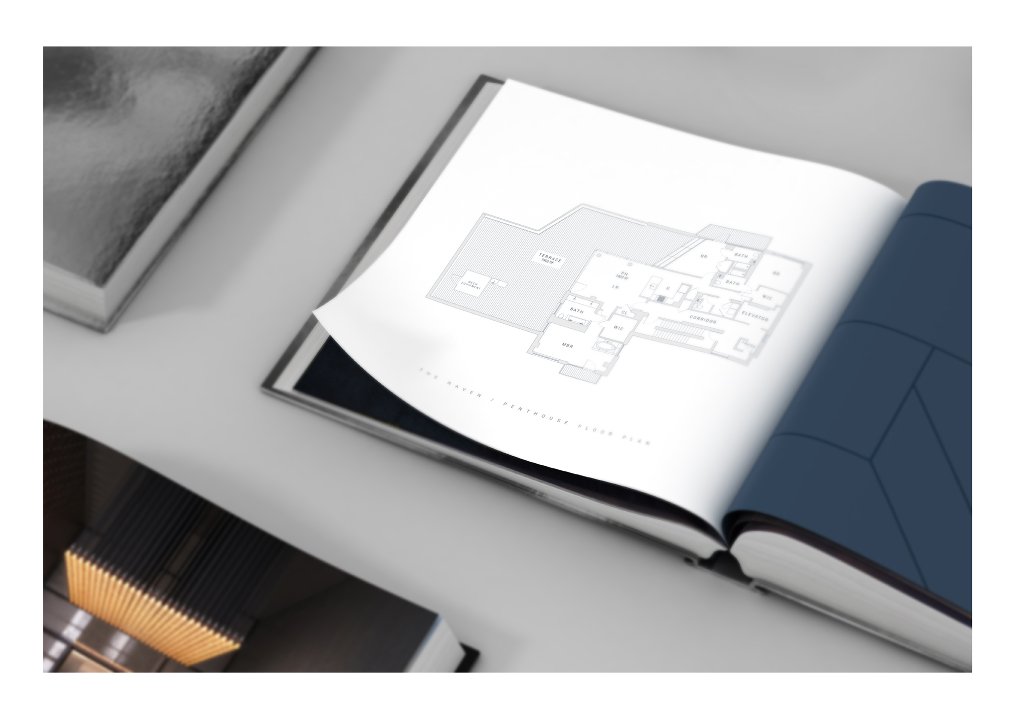
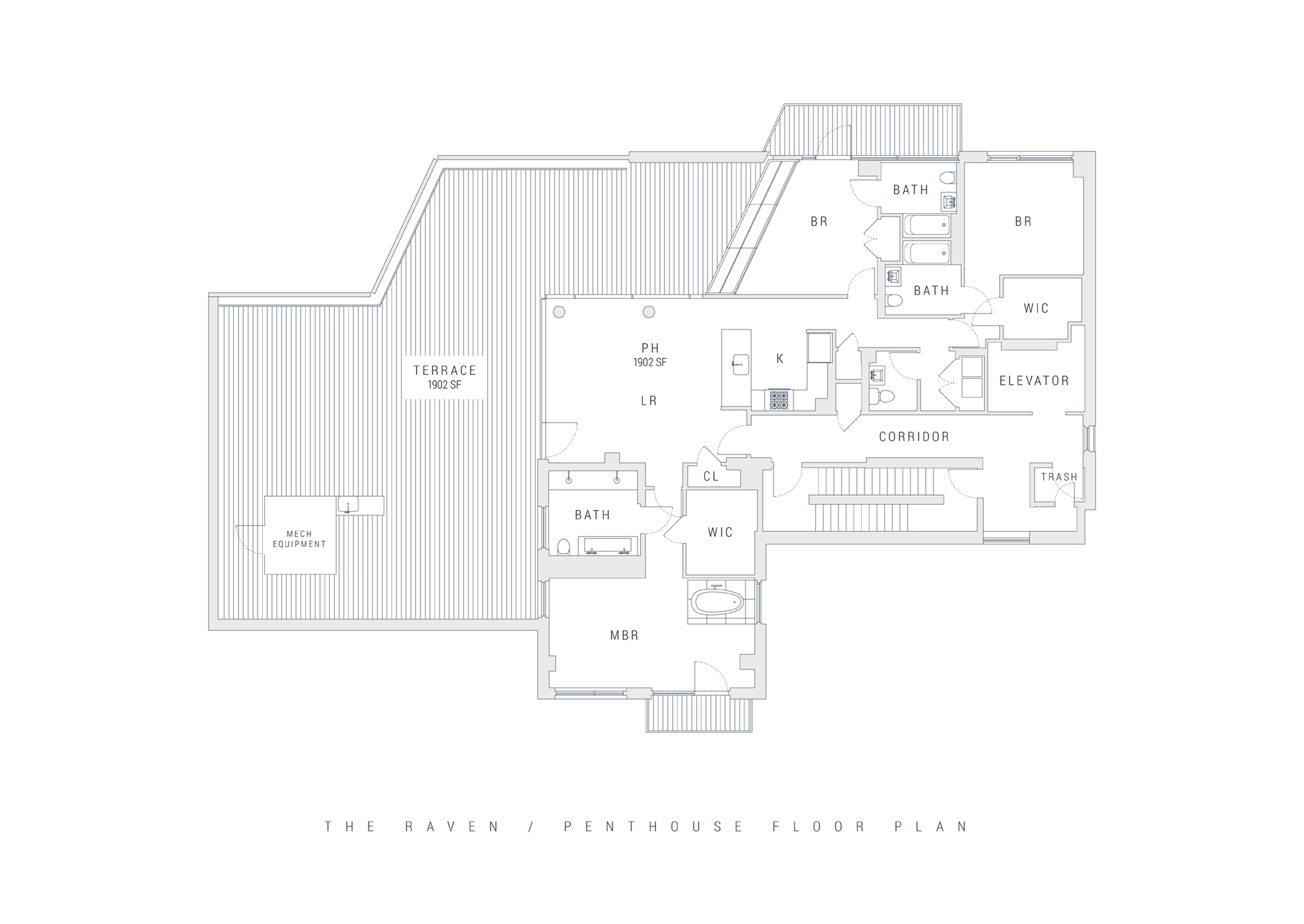
The Raven is the first mid-sized luxury condominium to be developed in the avant-garde neighborhood of Williamsburg, Brooklyn. Comprised of 30 residential units spread across six floors, each with a completely different and unique layout, and a nonproft art gallery, The Raven is truly one-of-a-kind.
Squat New York was tasked with giving the development a brand that appeals to the successful, young creatives and entrepreneurs who frequent the neighborhood for its eclectic, hip culture. This type of crowd is constantly looking for ways to differentiate themselves in terms of their clothes, food, hangouts and of course, homes. In other words, our major selling point would be the originality and modernity of the building itself.
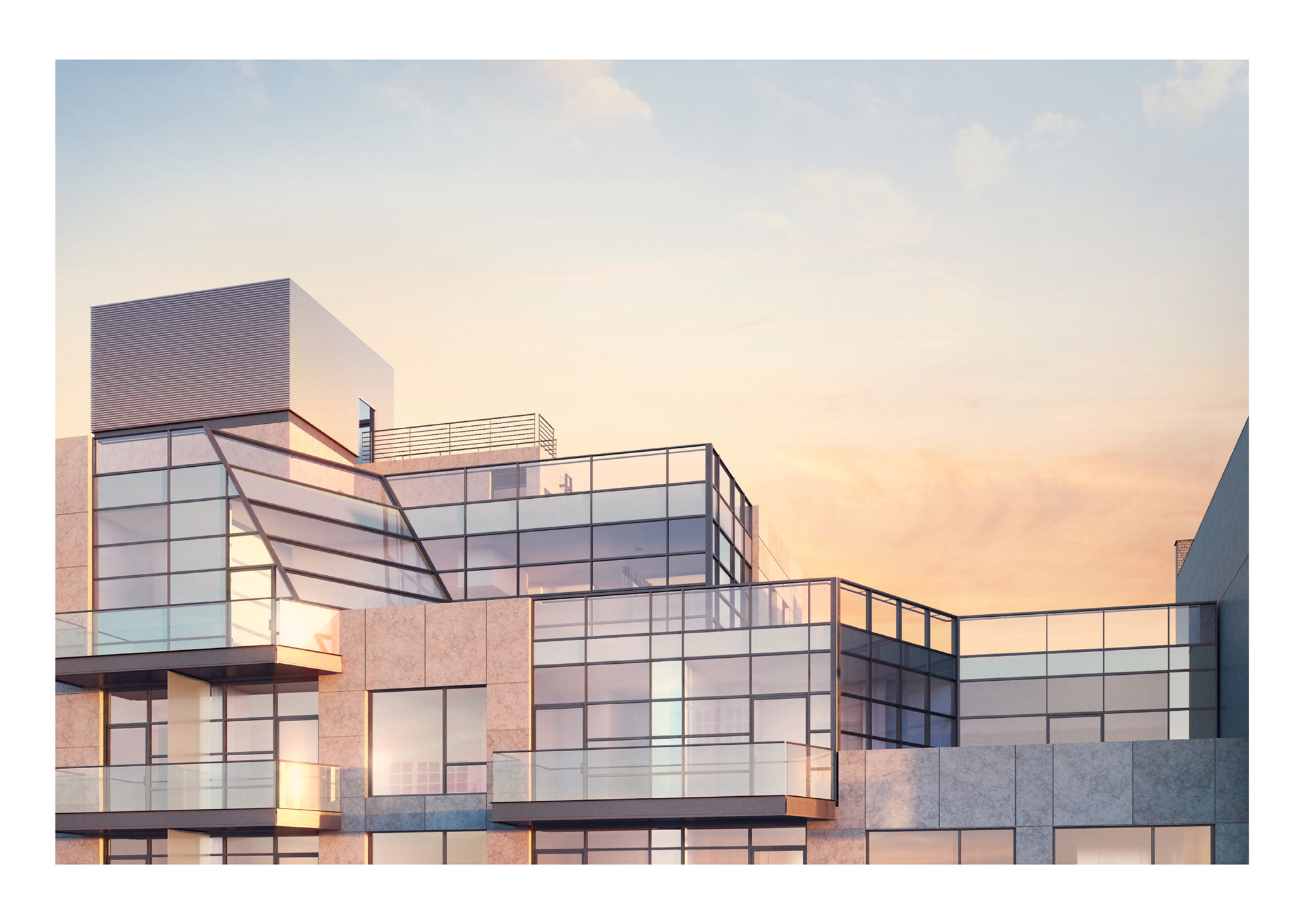
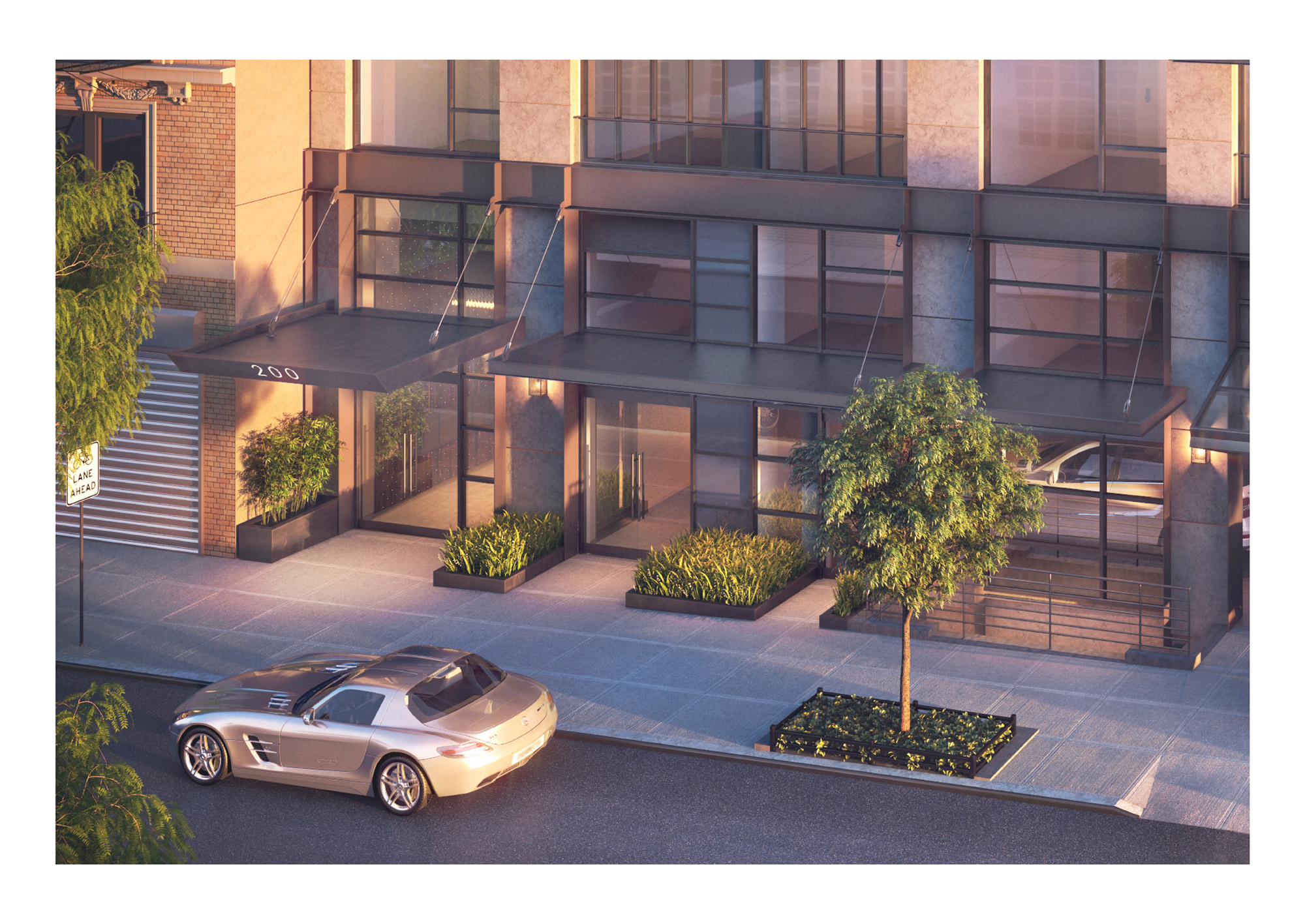
The development was dubbed “The Raven” for its ability to capture the building’s more industrial, enigmatic qualities. Ravens are known for having black feathers, but many fail to notice the sapphire blue they radiate in the light. Similarly, while the building’s standard concrete and glass exterior doesn’t particularly stand out, a closer inspection of its interior will reveal some of the most exceptional apartment layouts in New York City.
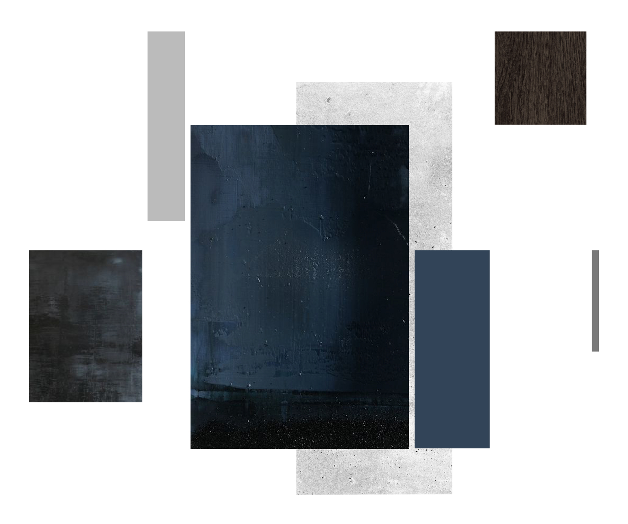
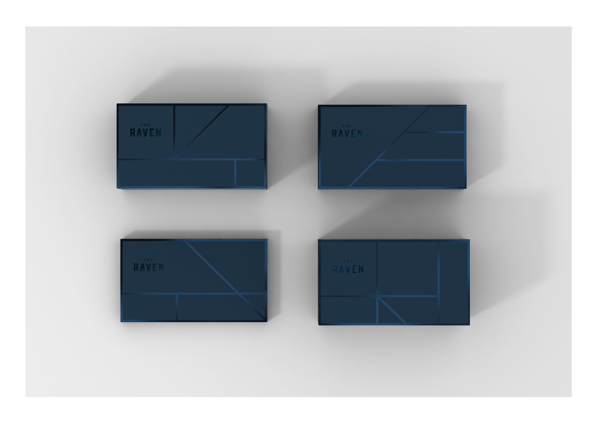
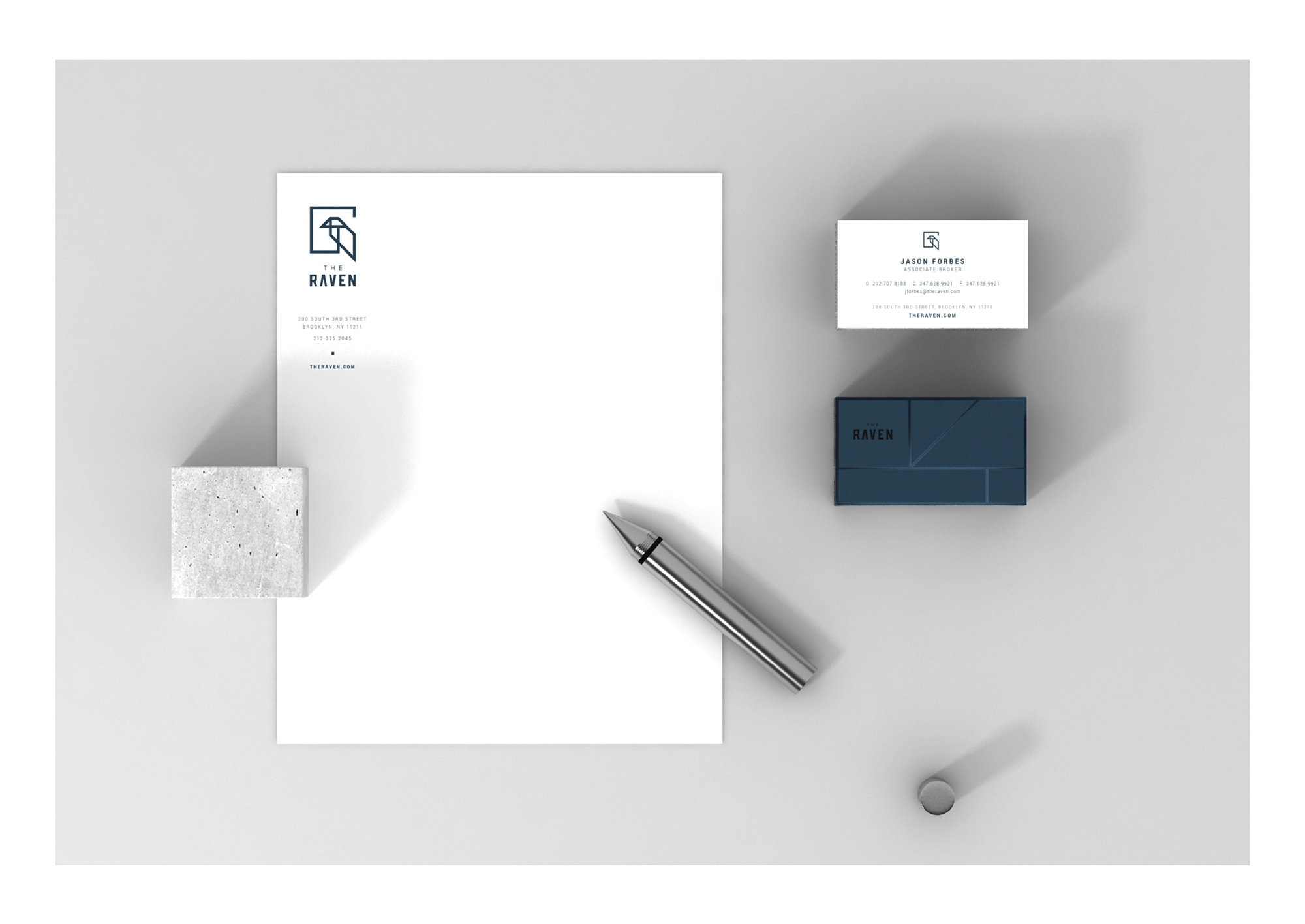
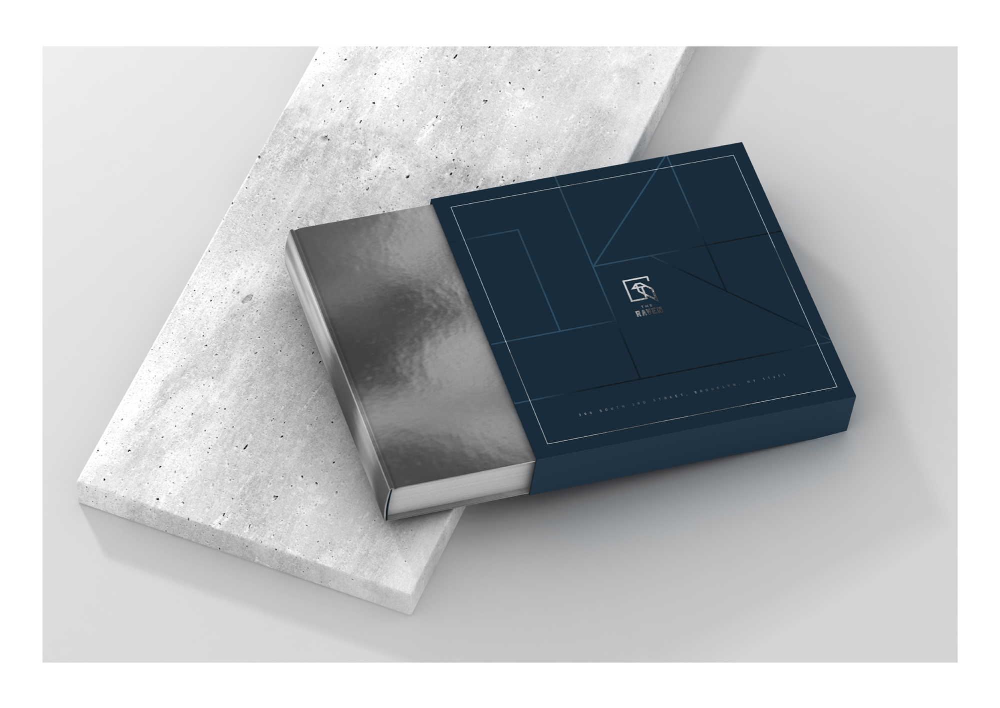
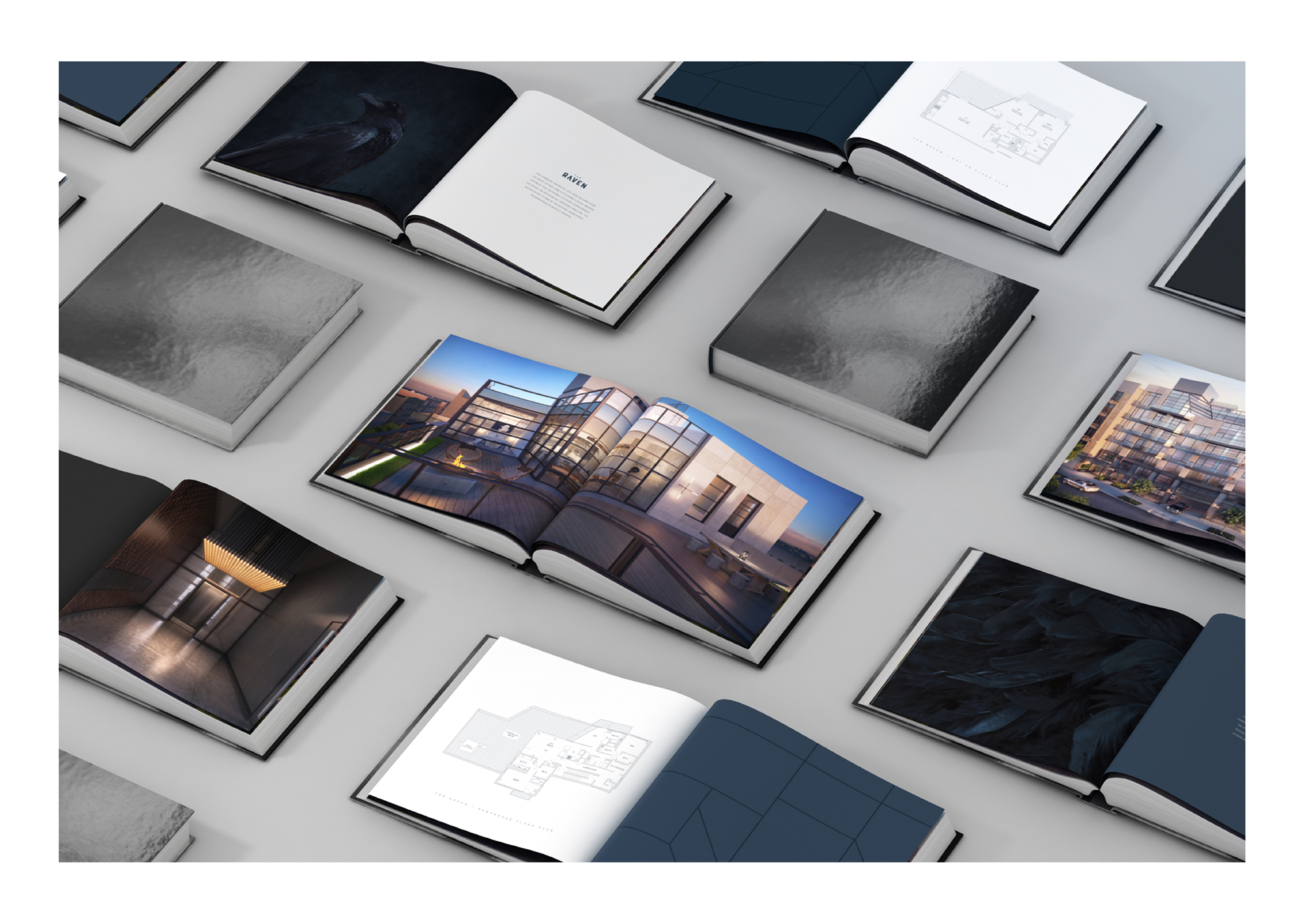
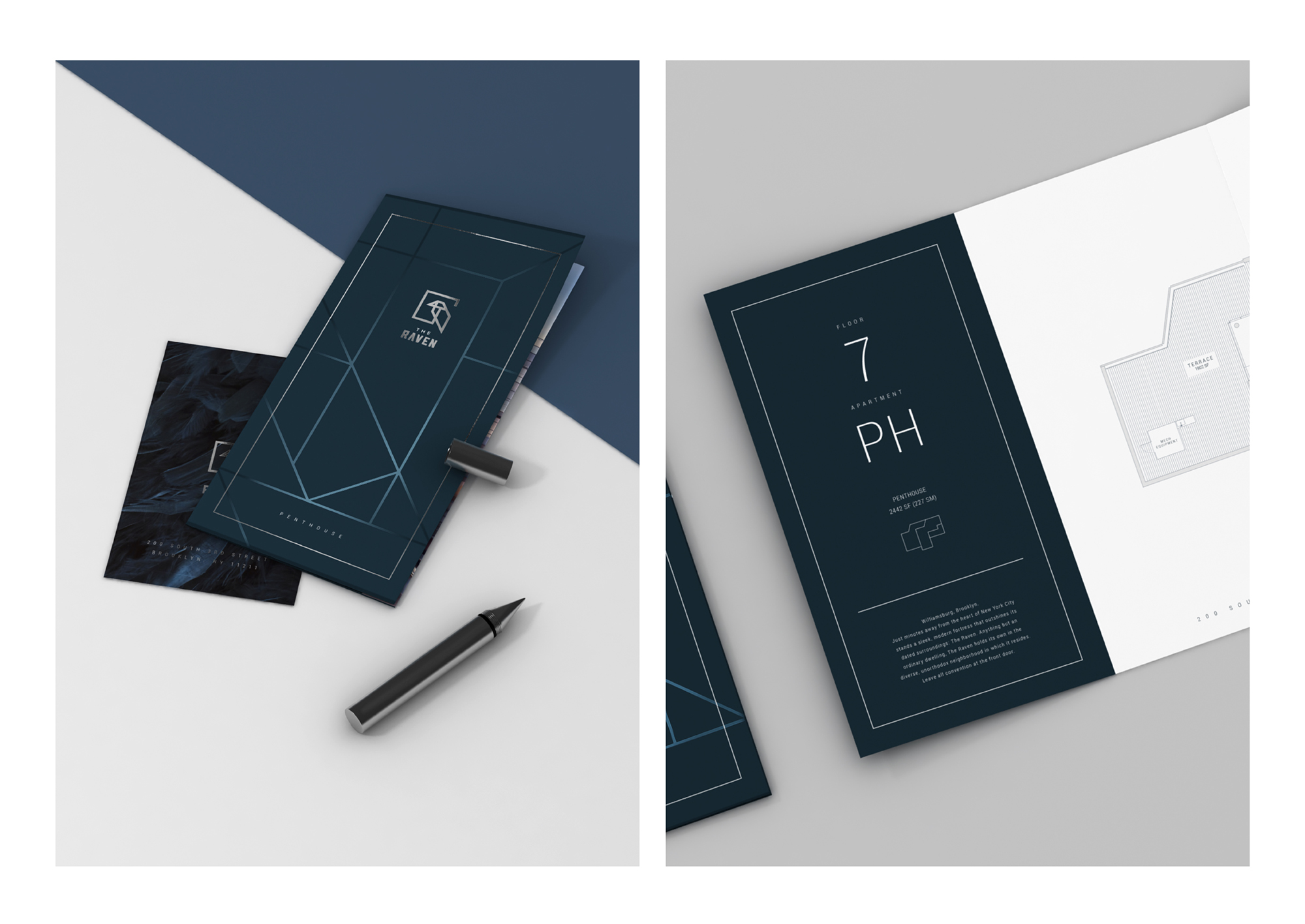
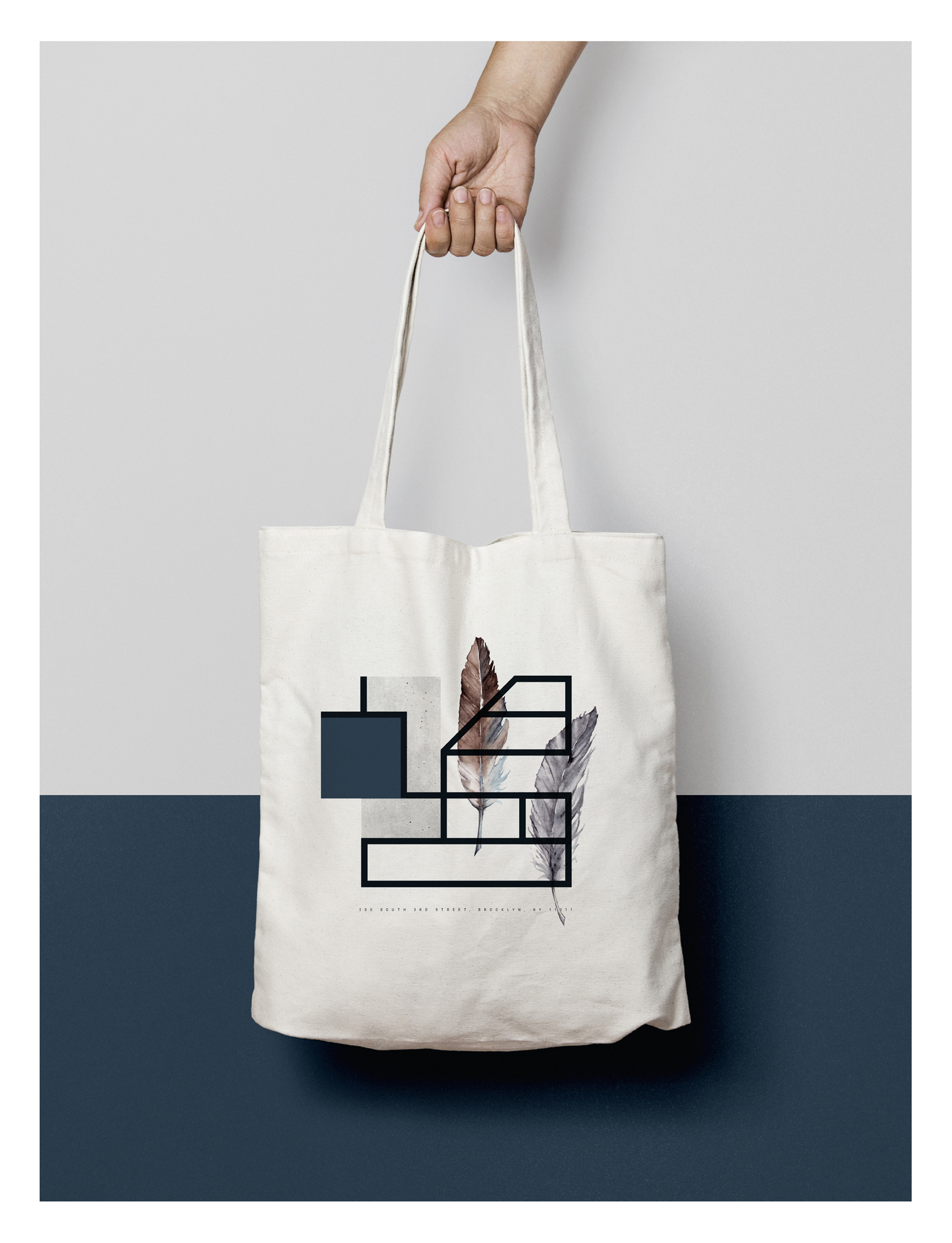
Inspired by the coat of a raven, the color palette consists of deep shades of blue and charcoal grey, which we applied to all marketing and stationery items. Business cards, folders and book covers also feature a unique, embossed portion of the logo in glossy foil atop a matte backdrop for a polished look and feel.
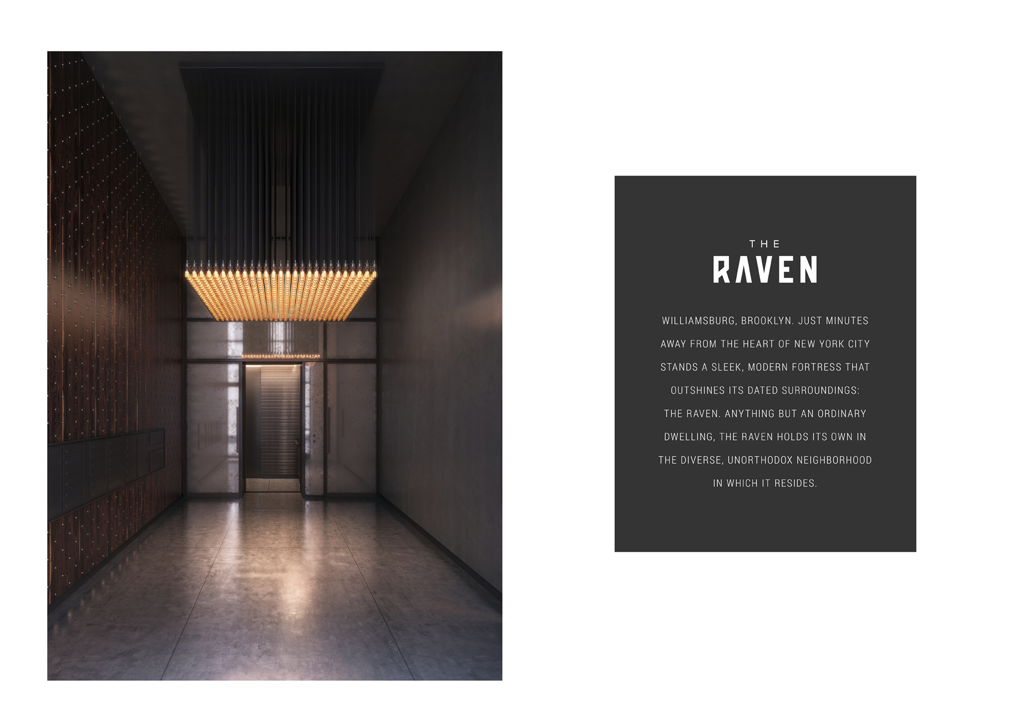
For the logo, we crafted a minimalistic sketch of a raven comprised only of a single, solid line, which reflects the building’s industrial feel and the strength of its steel window frame. So as to demonstrate the logo’s intimate connection with the building’s structure, we built a statue that looks to be a miniature replica of the building when viewed straight on, but from a top angle, takes the form of the logo.

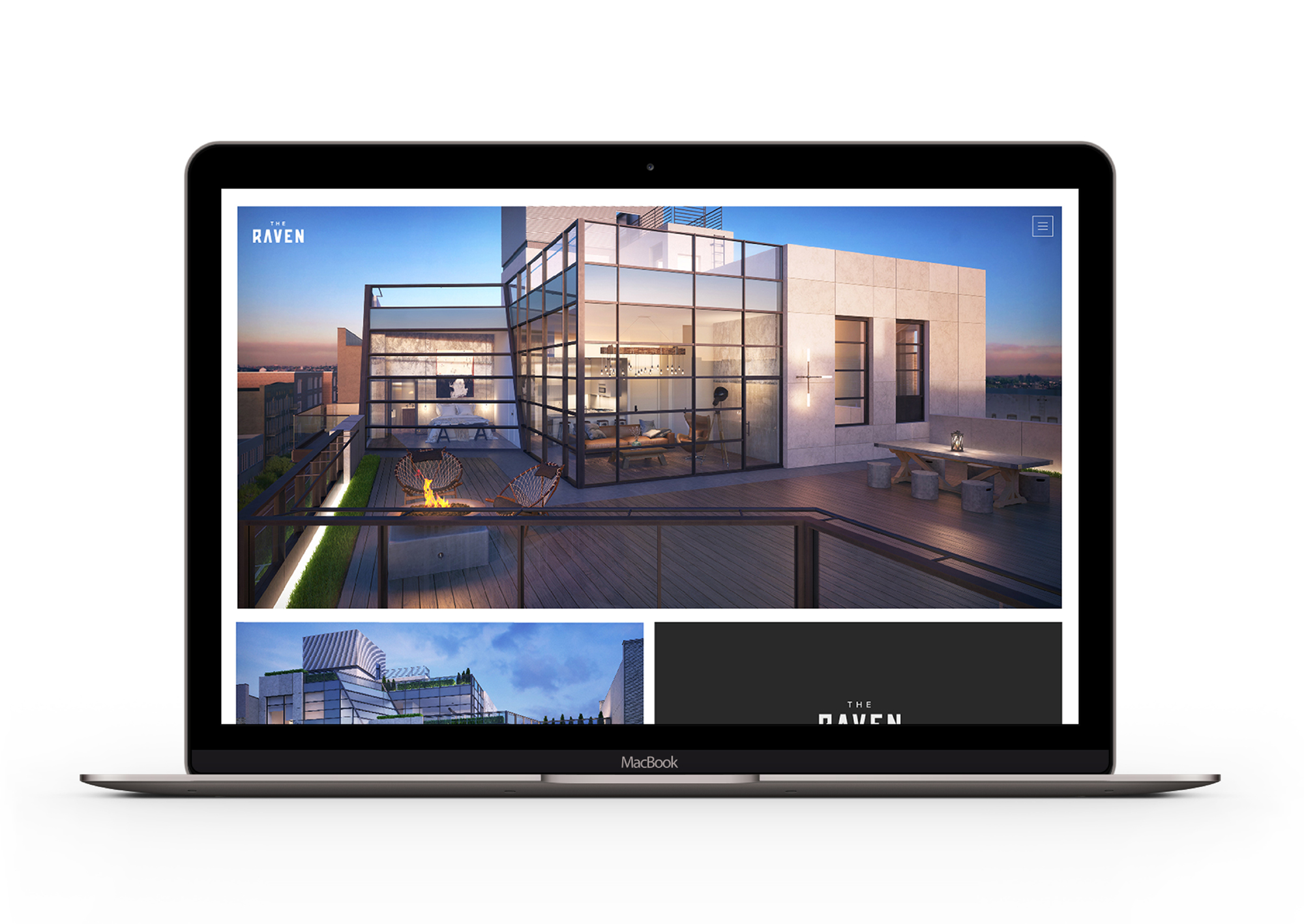
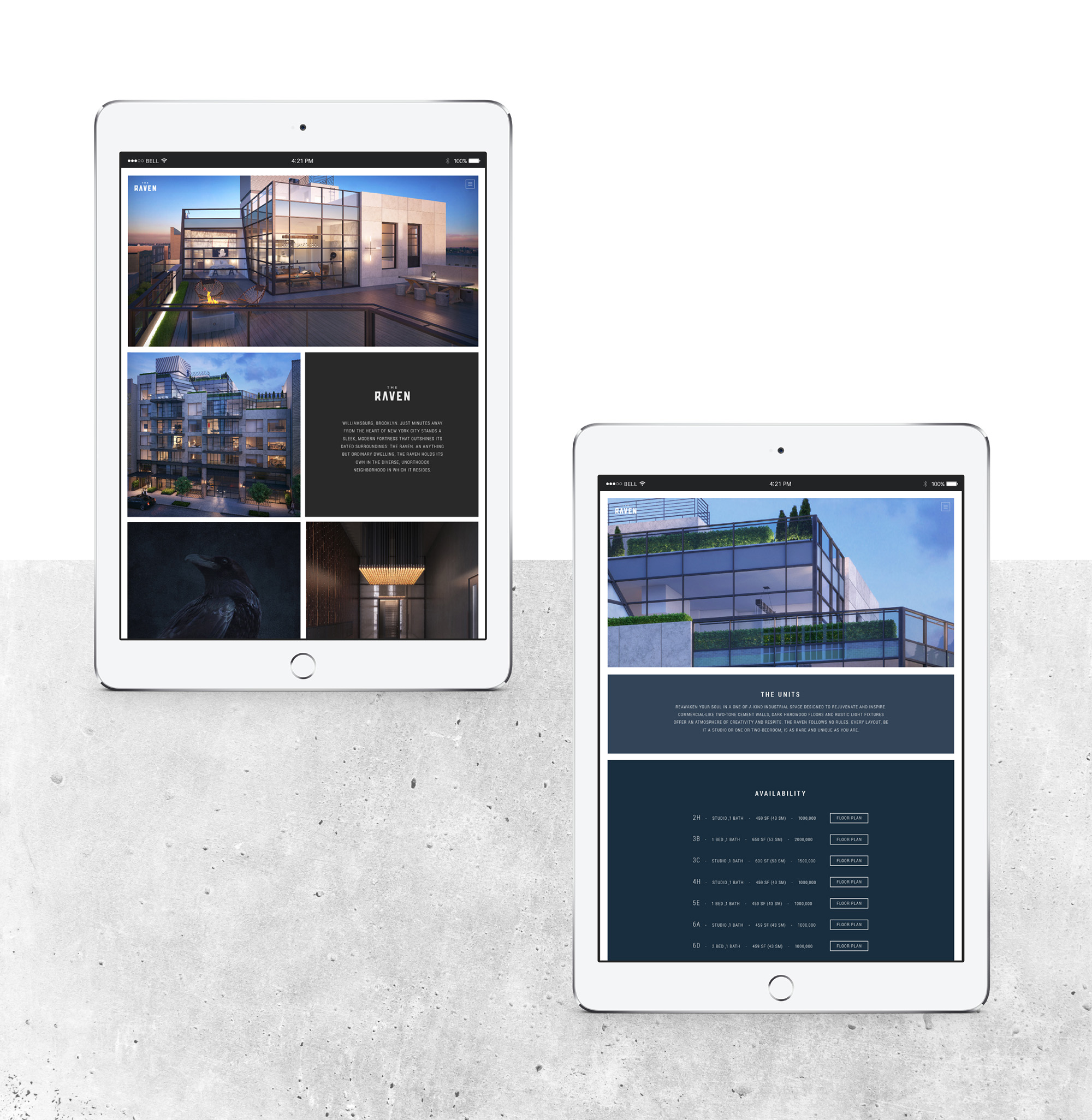
The final part of the branding process involved designing a sleek, modern and easy-to-use website. Our design features a minimalistic interface that gives particular attention to the sharp, high-quality renderings of the condominium’s interior and exterior. We also had to seek out the best way to present potential residents with everything they could possibly want to know, from the building’s backstory to details about room layouts, amenities and room availability. This included choosing a classic, legible webfont that gives the impression that it would be the exact style of a raven’s handwriting were it to take on a human form.
The result of our creative endeavors was a cohesive, magnetic brand identity destined to attract potential residents and establish The Raven as the premier condominium in Brooklyn.
Thanks! You have been successfully added to our mailing list. Expect a confirmation e-mail shortly.
Sorry, we weren't able to sign you up. Please check your details, and try again.
We will be in touch with you shortly.
