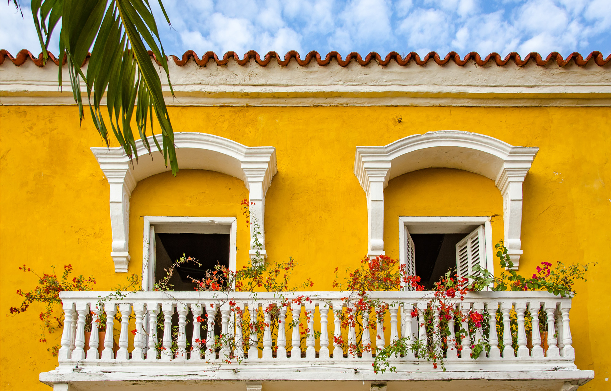
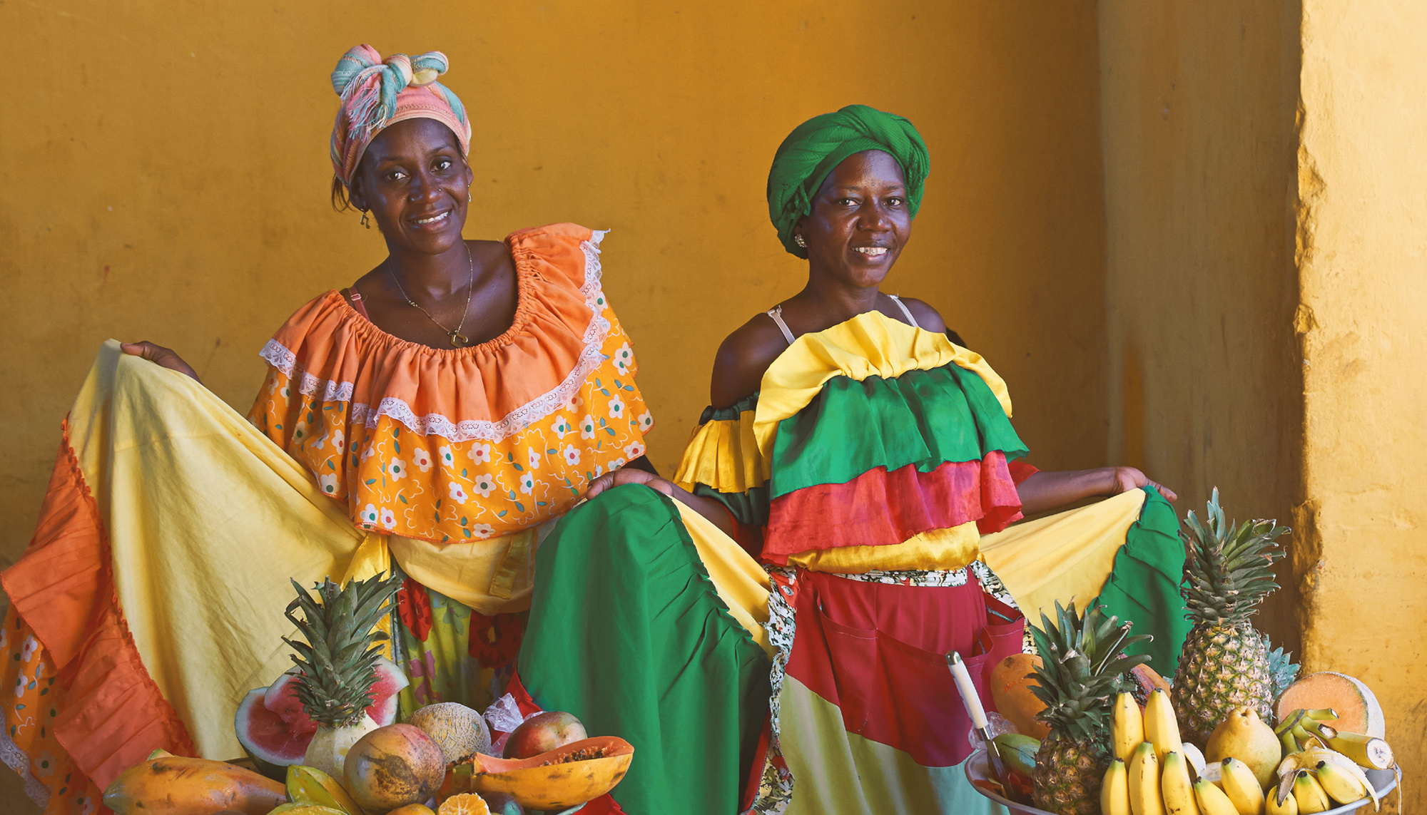
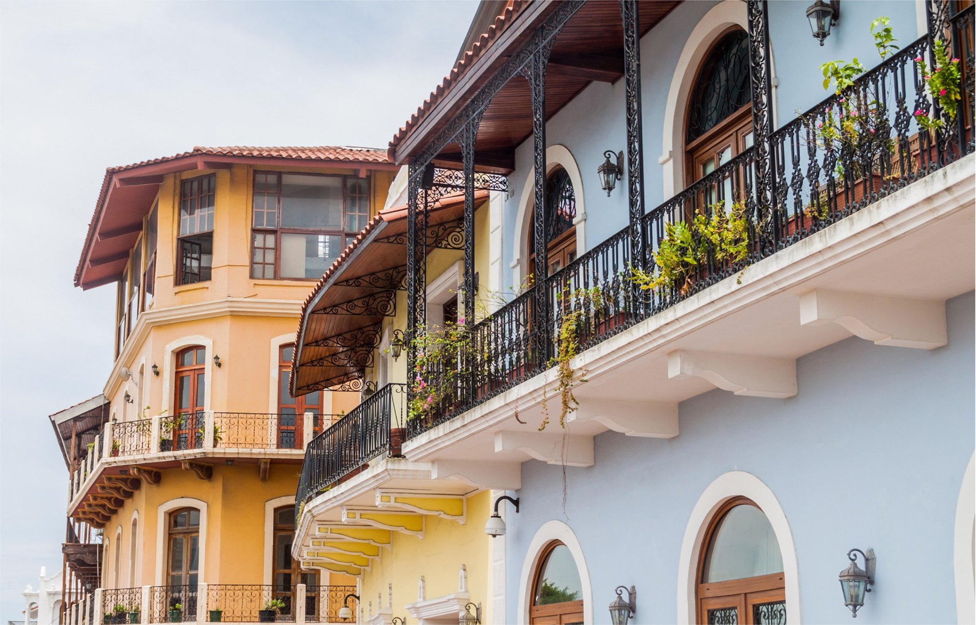
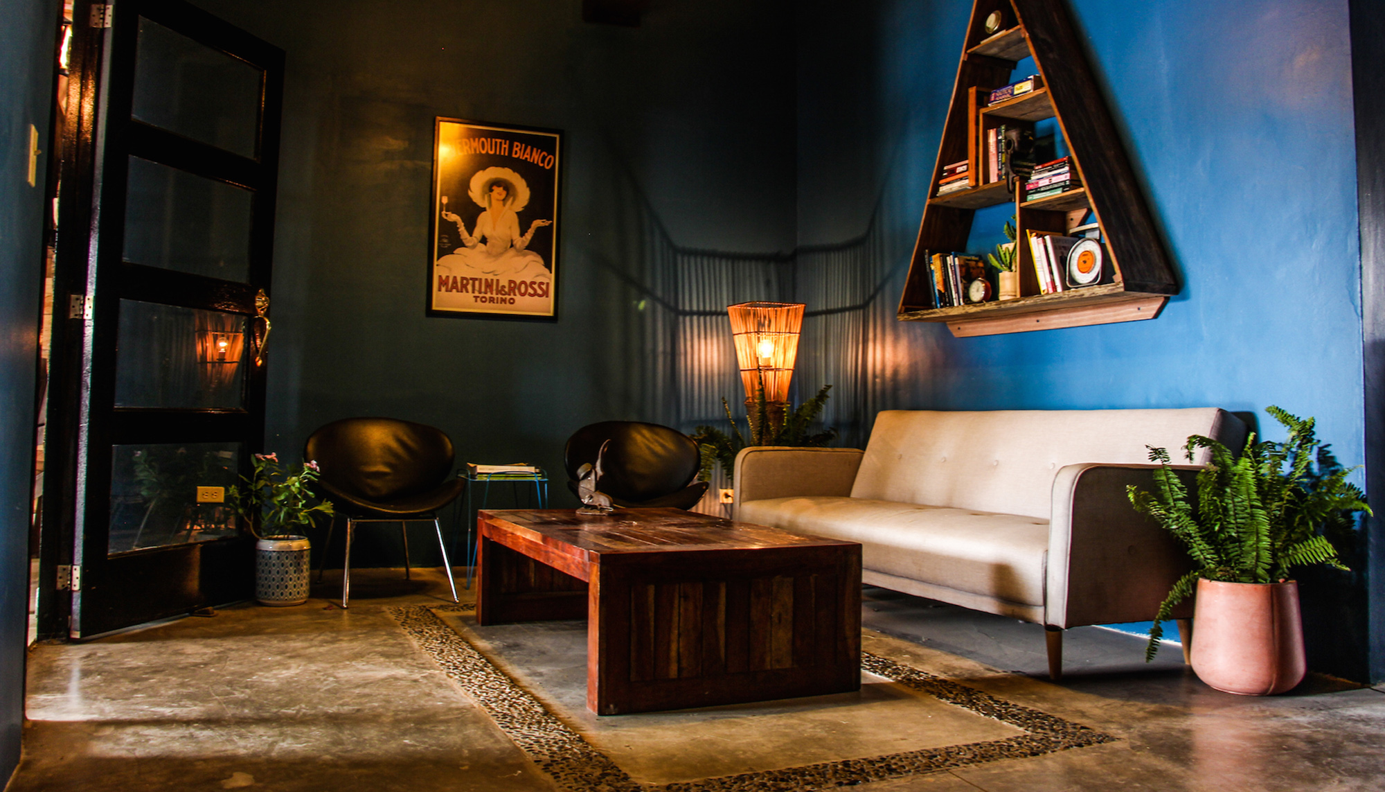
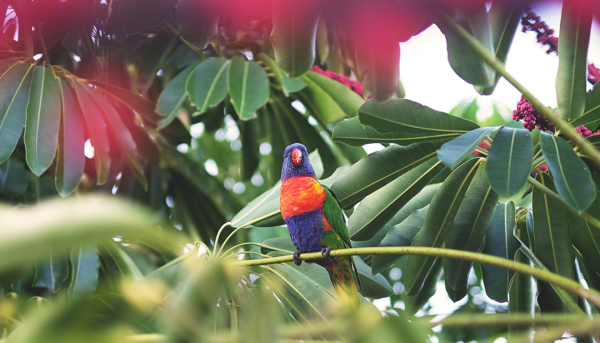
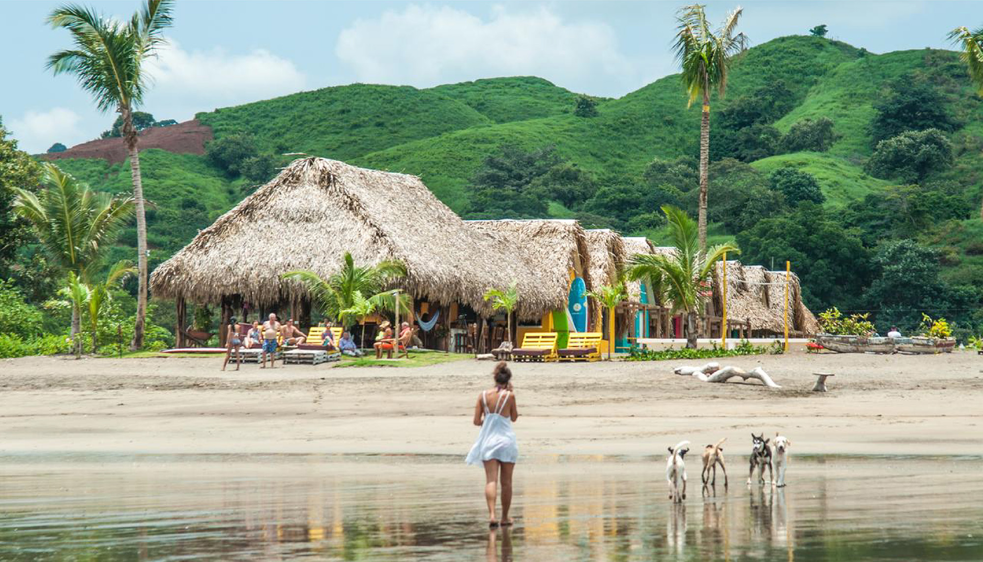
Selina is one of the only hostel chains in Latin America offering guests luxurious, yet budget-friendly sleeping rooms and coworking spaces for workers on the go. The company’s previous brand was geared toward a young, fun-loving crowd, more interested in enjoying a party atmosphere than cultural experiences. Selina came to Squat New York looking for a new brand face that unites and appeals to a modern, slightly older generation of “macpackers.” These are serious travelers who desire to expand their cultural palate and make their trips both personally and professionally productive. With this more mature audience in mind, we set out to build a brand reflective of each location’s exploration opportunities, communal learning spaces and Latin American flair. Several options for the brand story, look and voice emerged from our efforts – one of which is currently featured on Selina’s website and another which we have presented below.
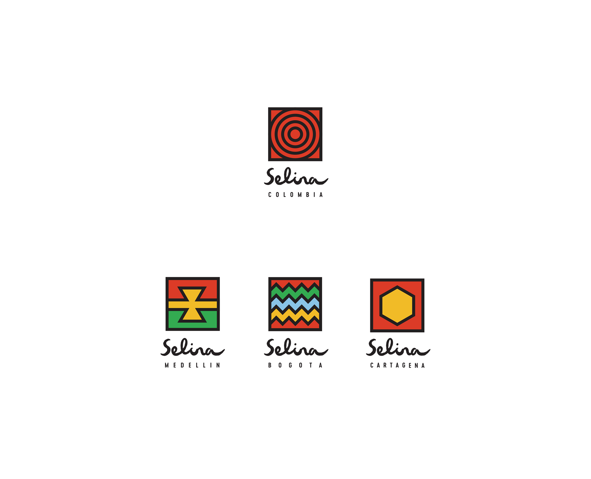
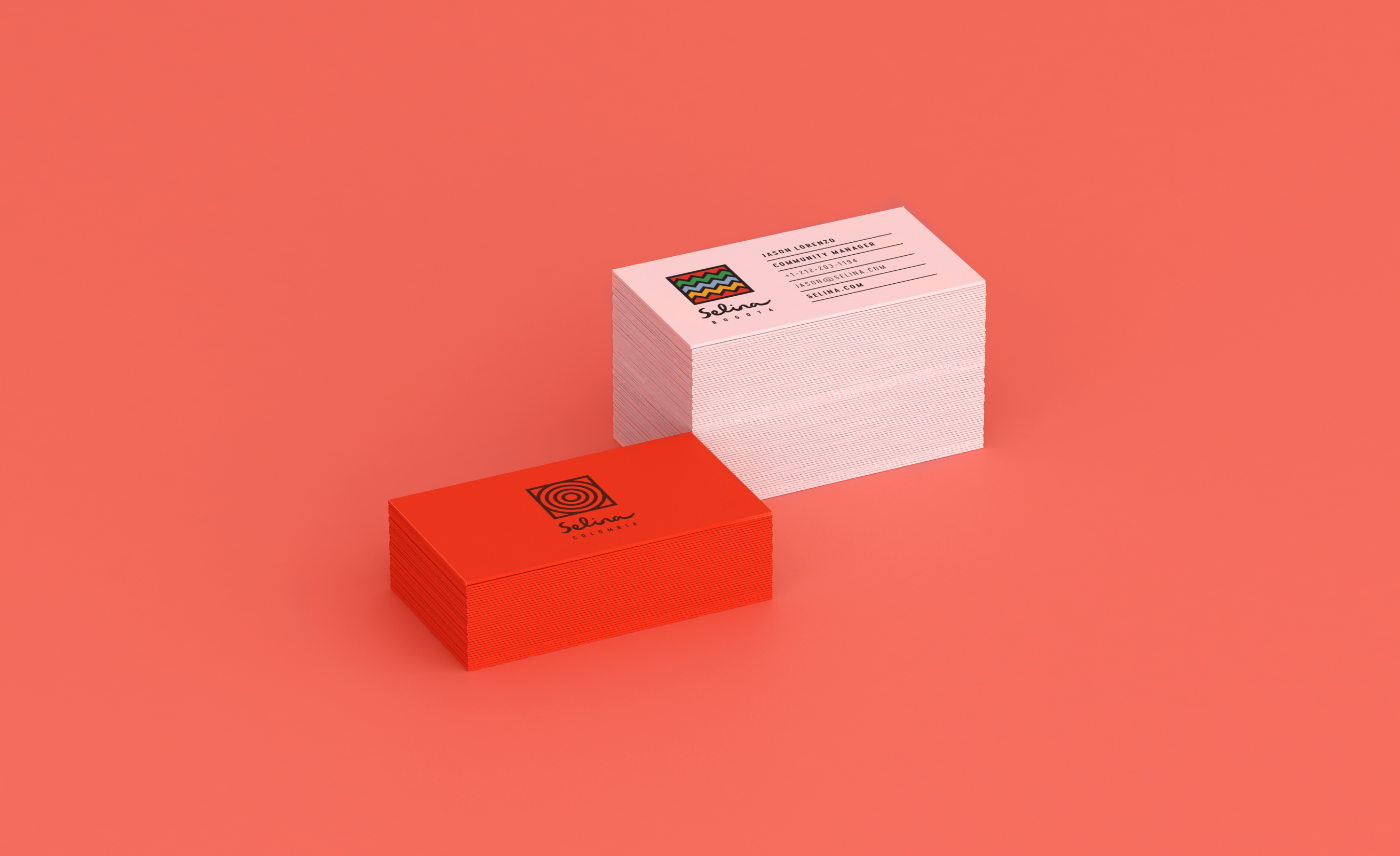
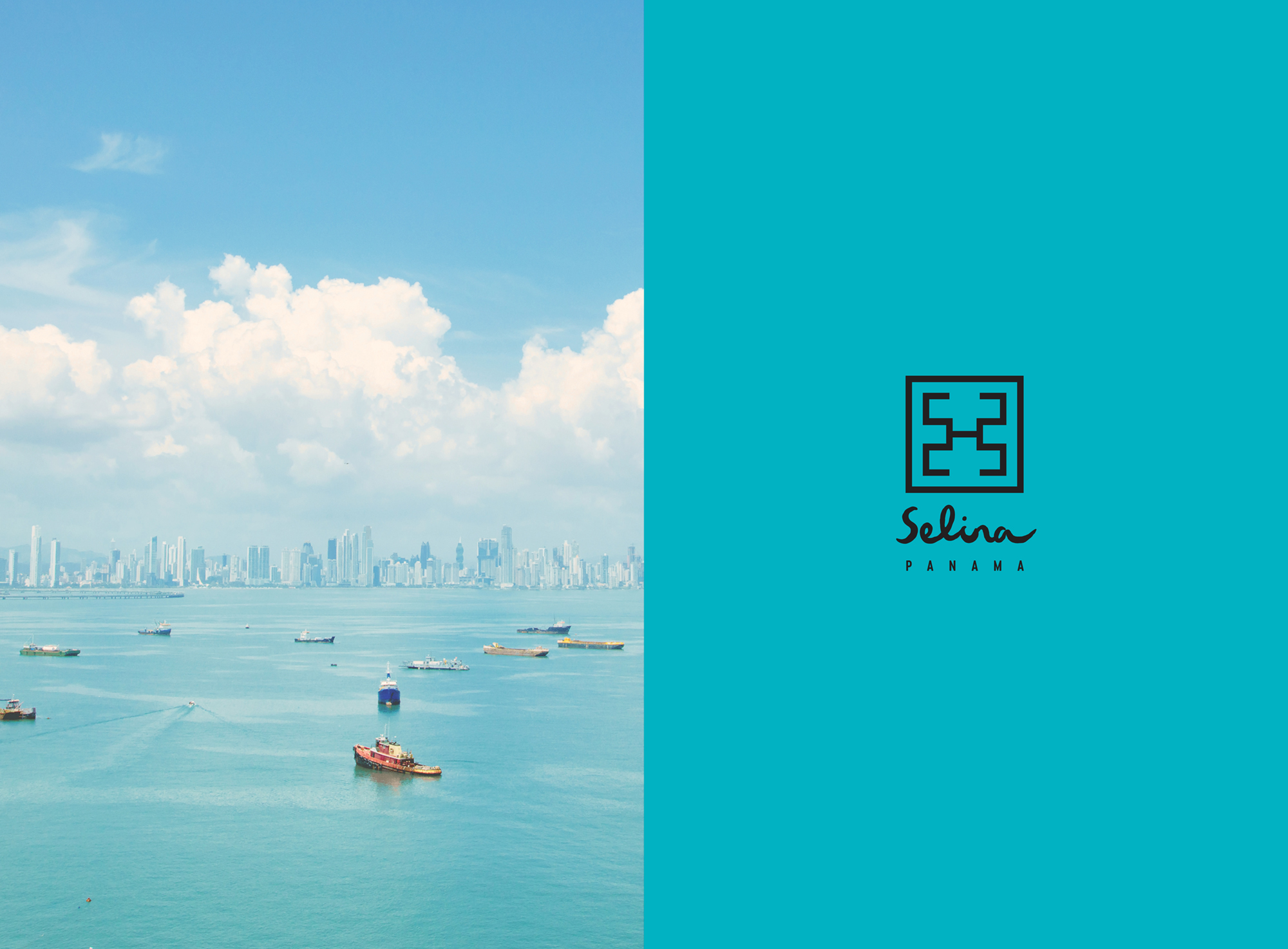
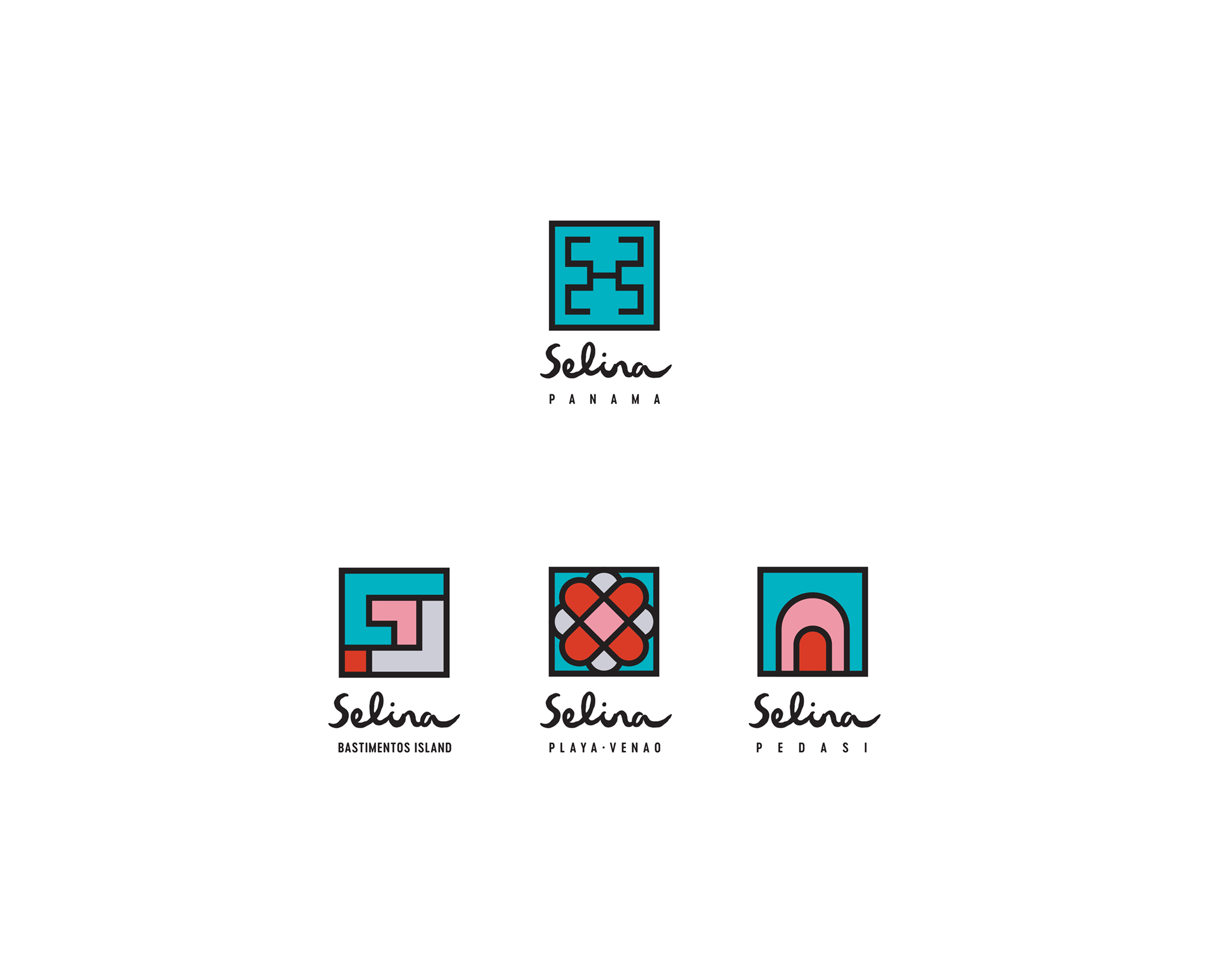
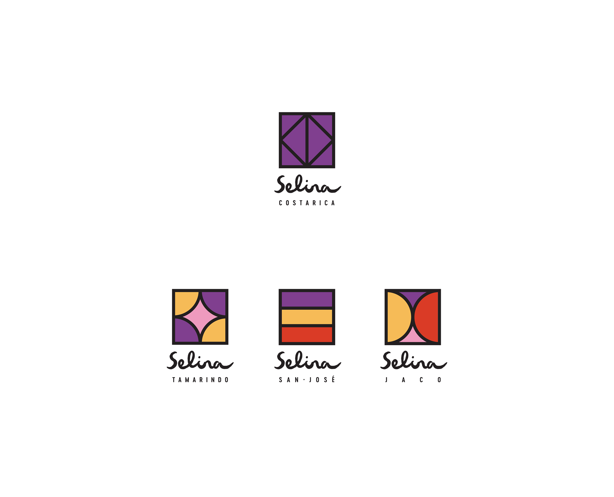
Departing from clean, generic logotypes, we crafted Selina’s new logotype from scratch. With this handwritten look, it takes on an individualistic character reminiscent of the personalized experience Selina offers travelers. The uneven lines waver, pulsing with the activity and rhythms of Latin American lifestyles. One letter rolls into another, like inspiration flowing from person to person as new connections form and flourish. This unique script serves as the signature logo for Selina’s entire chain of establishments.
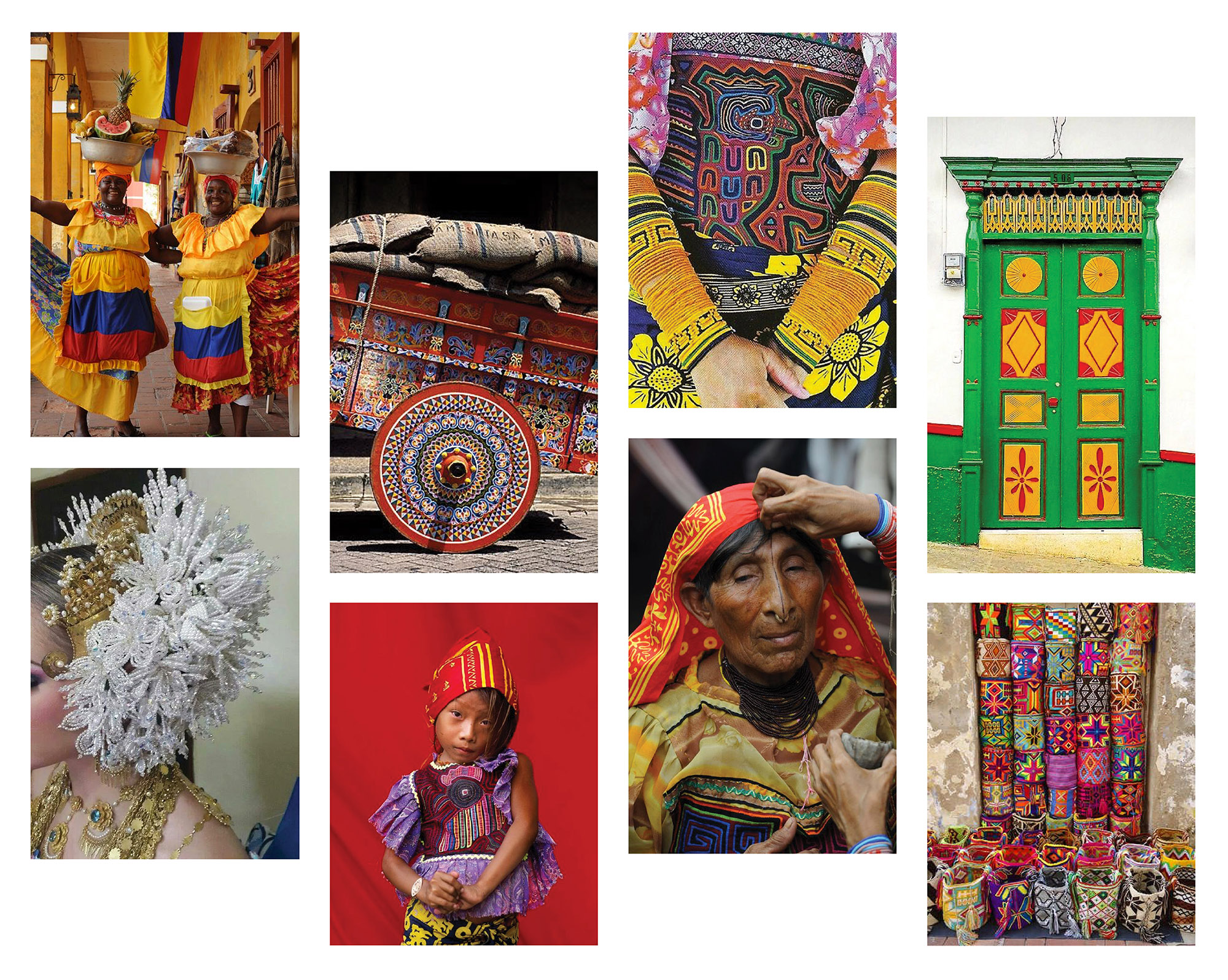
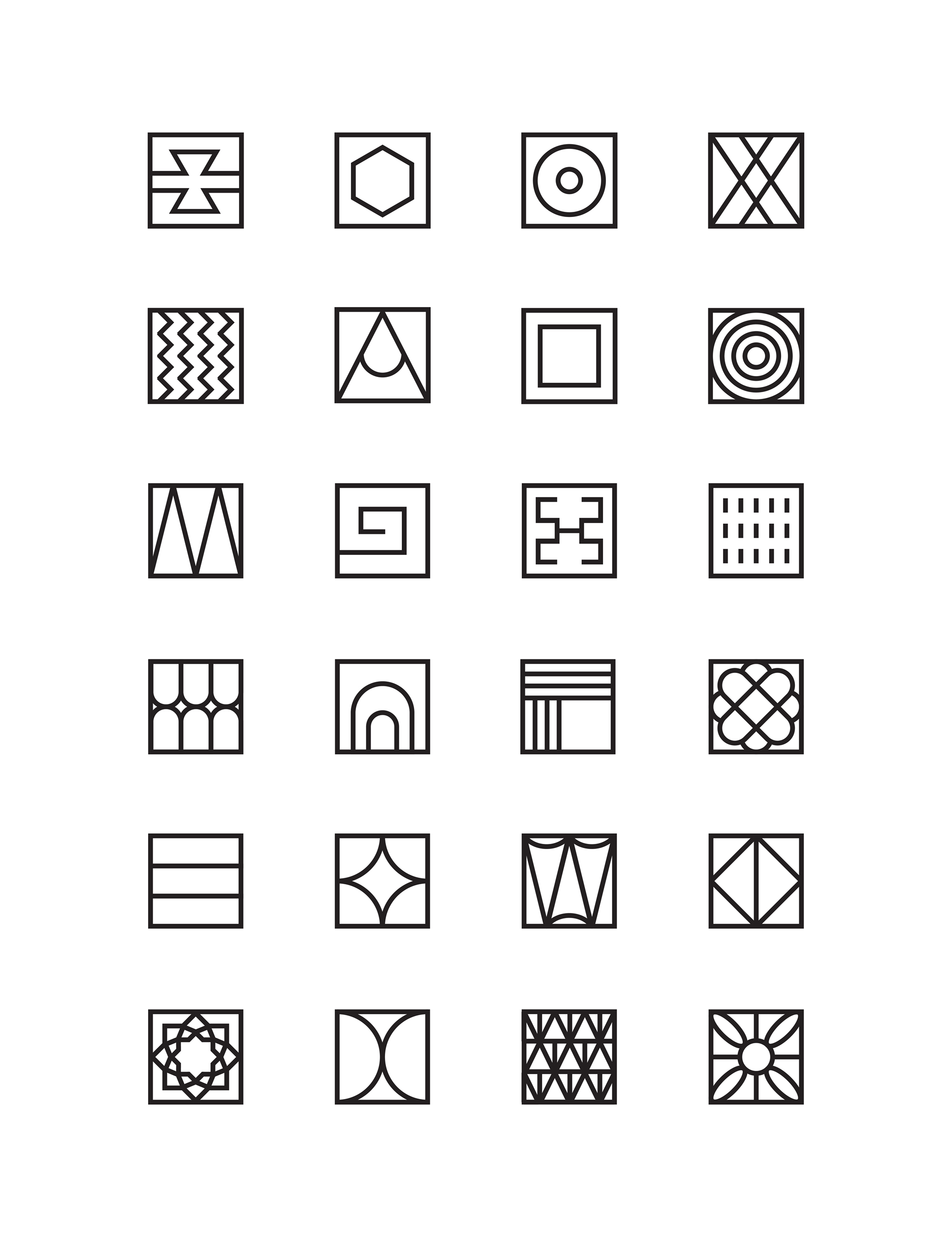
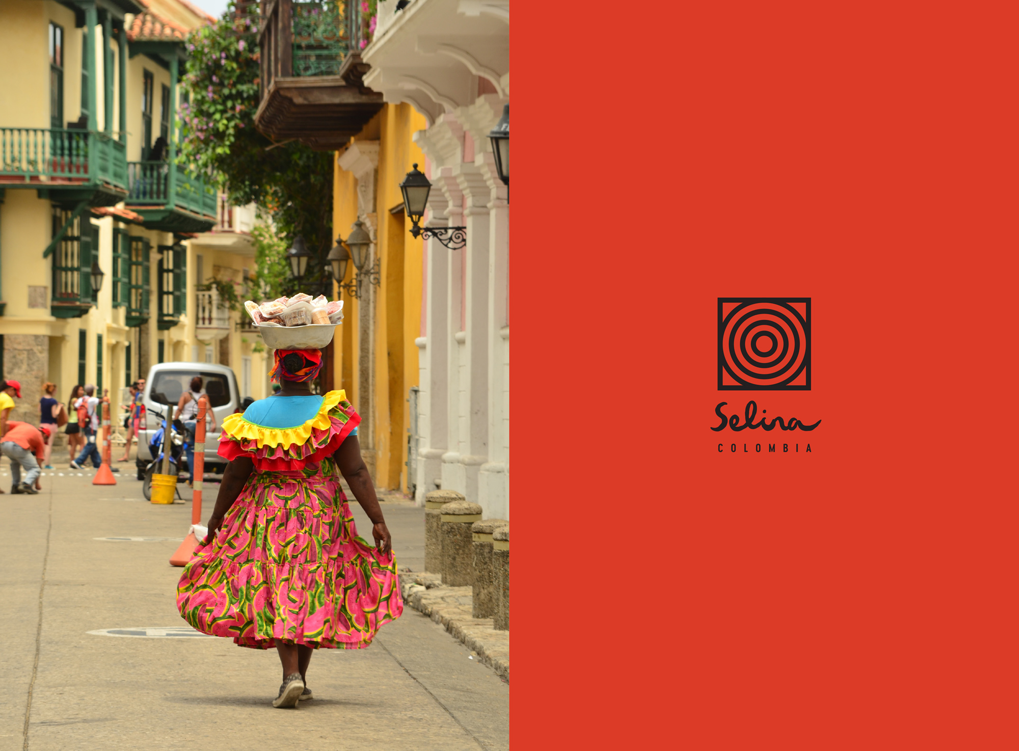
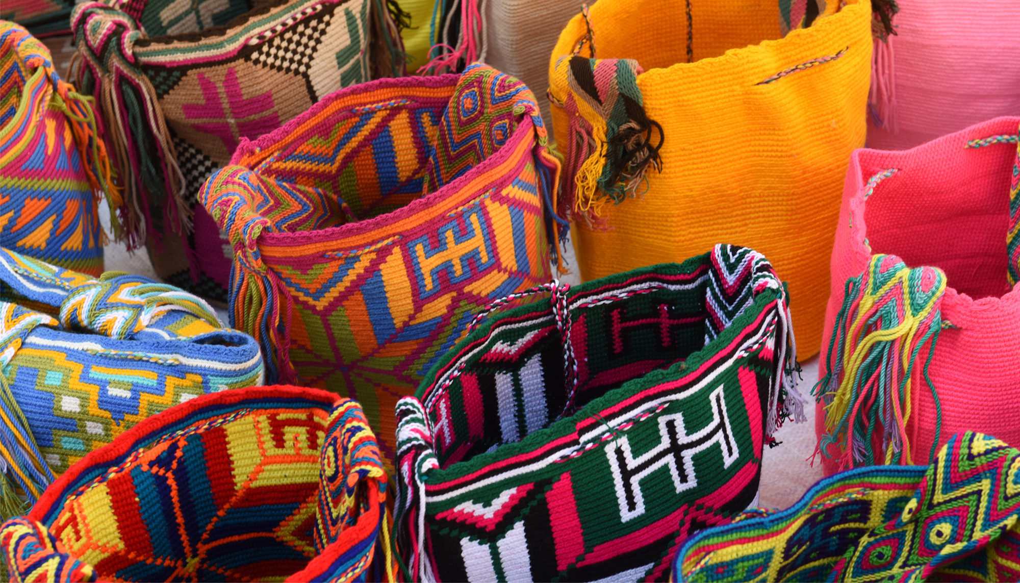
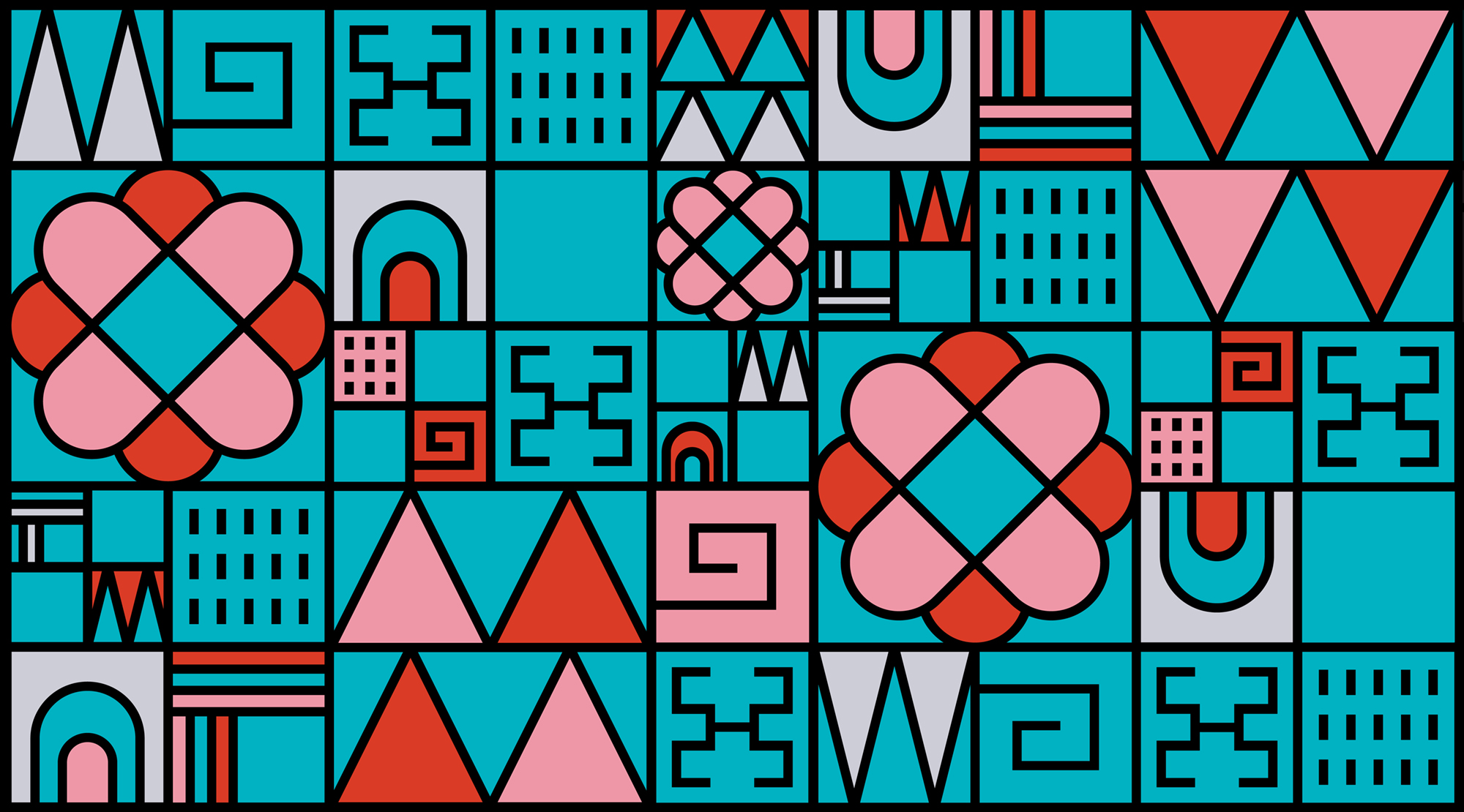
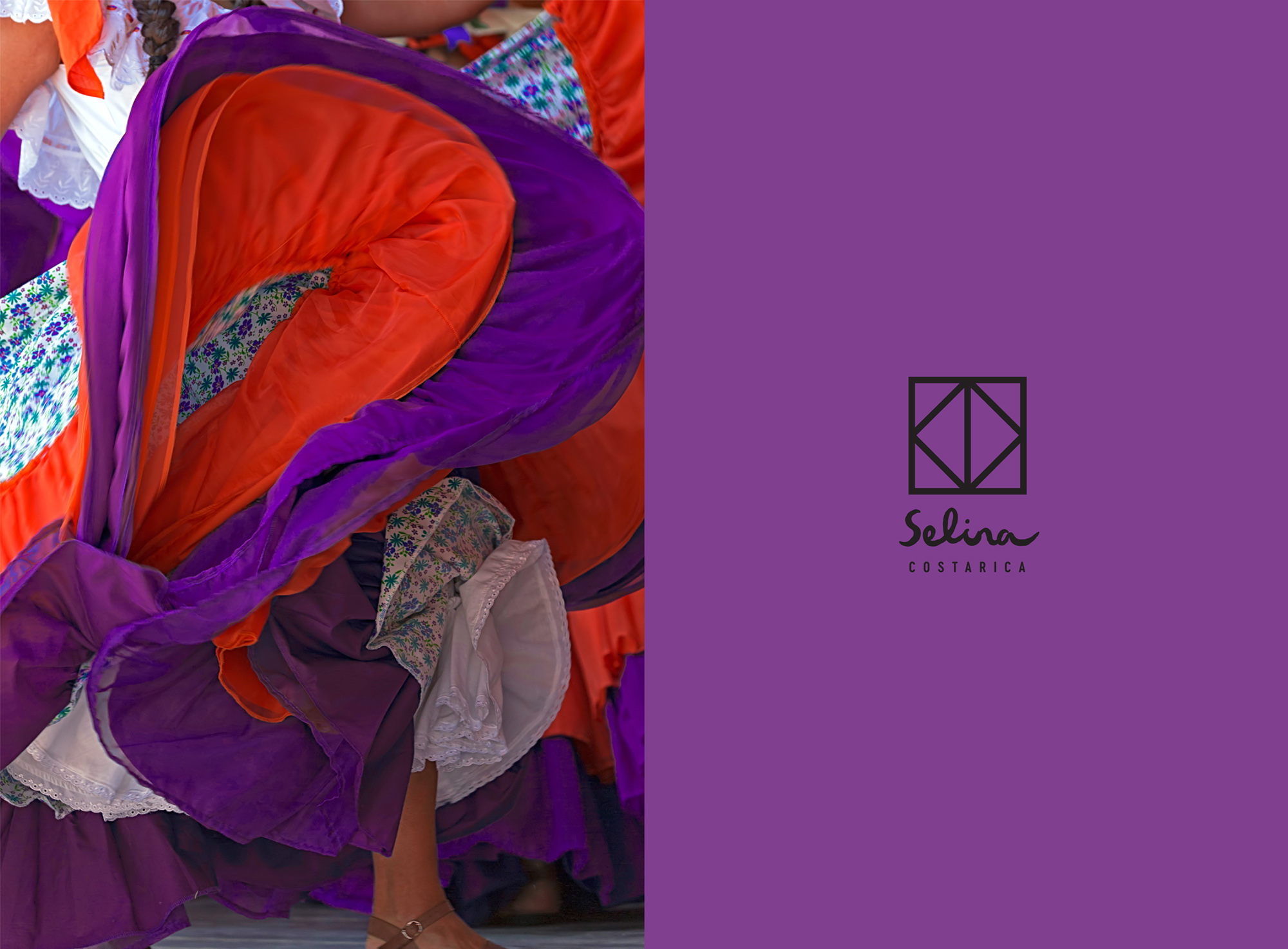
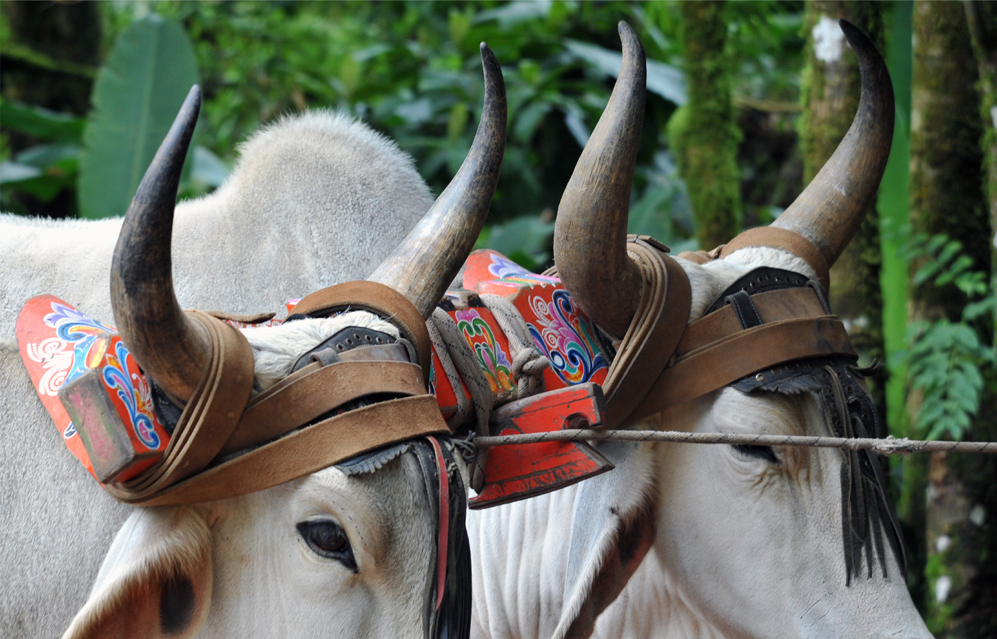
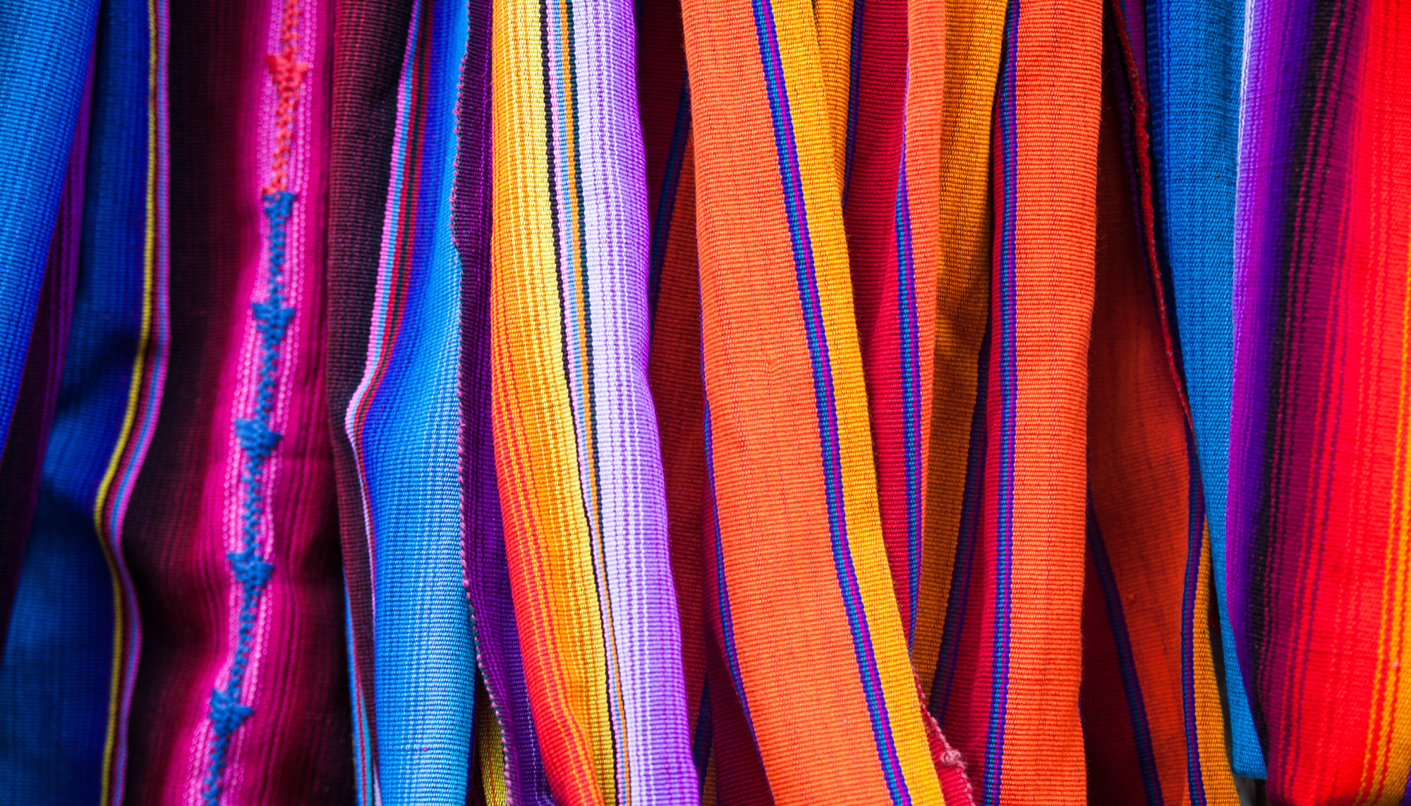
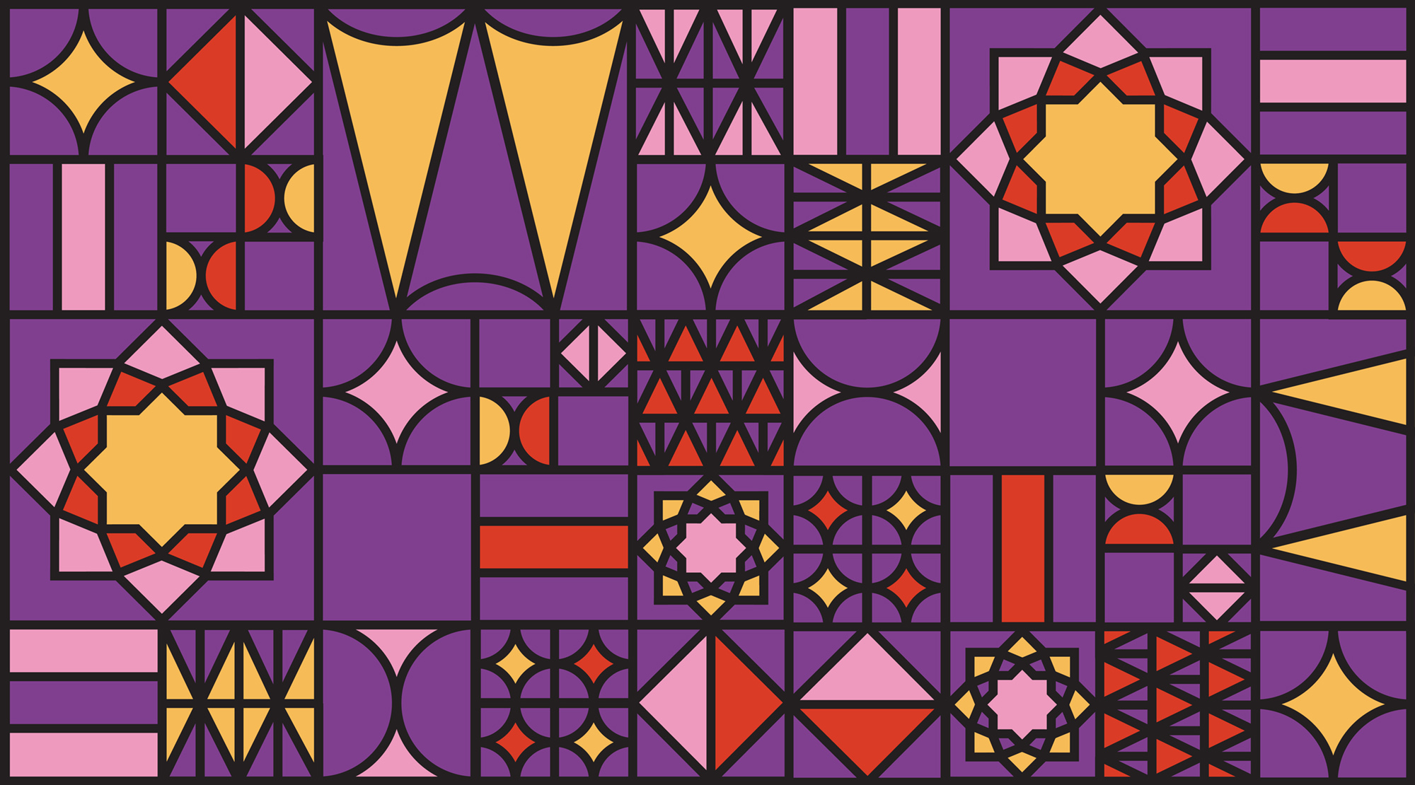
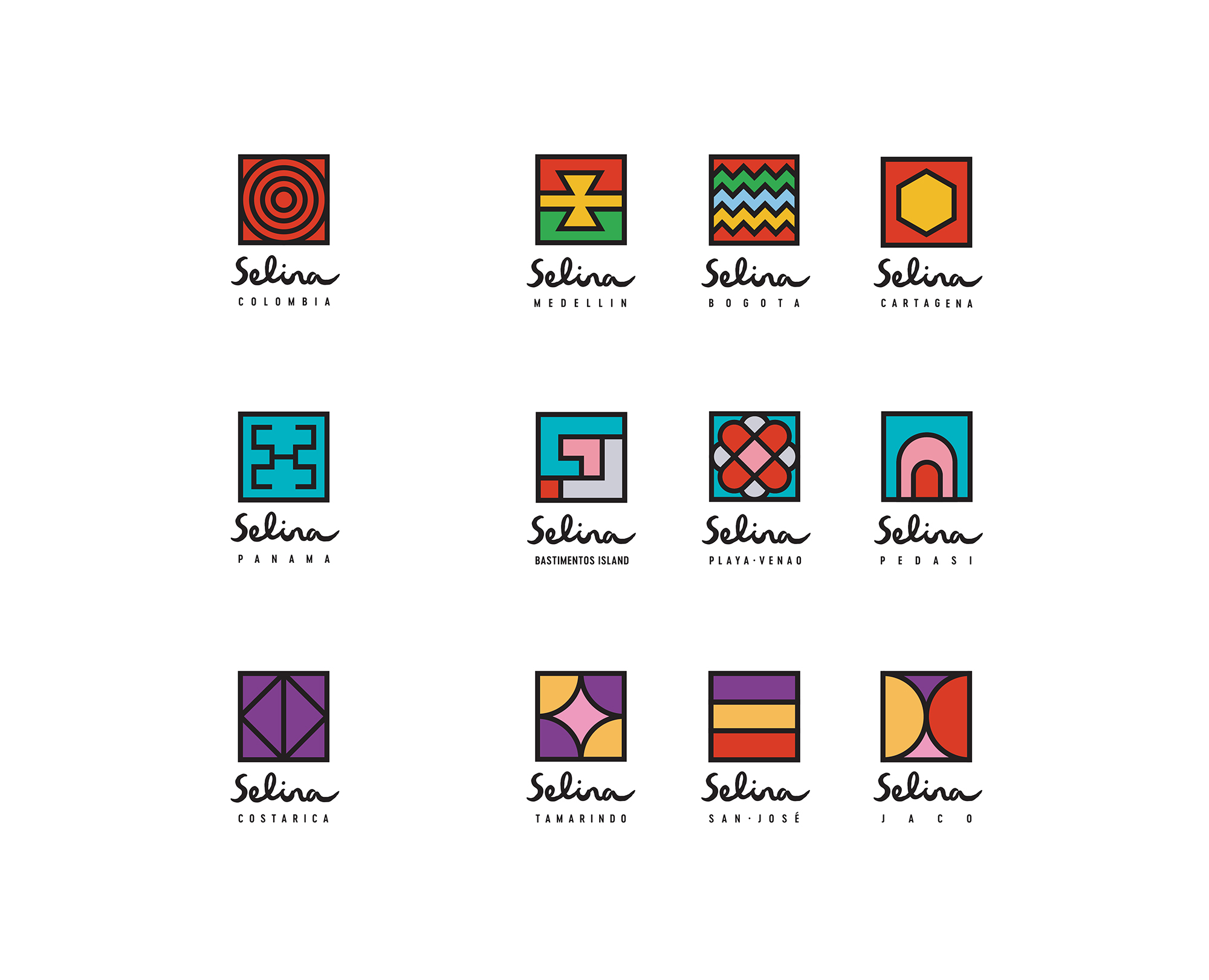
We developed a secondary logotype for Selina’s current sub-brands and locations: Panama, Costa Rica, Colombia and the Caribbean. Every letter of this clean, sans serif type was given a generous amount of space, so as to mirror the lines of the indigenous patterns and textures they were paired with. For individual patterns, we took visual cues from all different aspects of each region’s unique culture, including commonly-used textiles, traditional crafts, weaving, beading, body markings, and fashion.
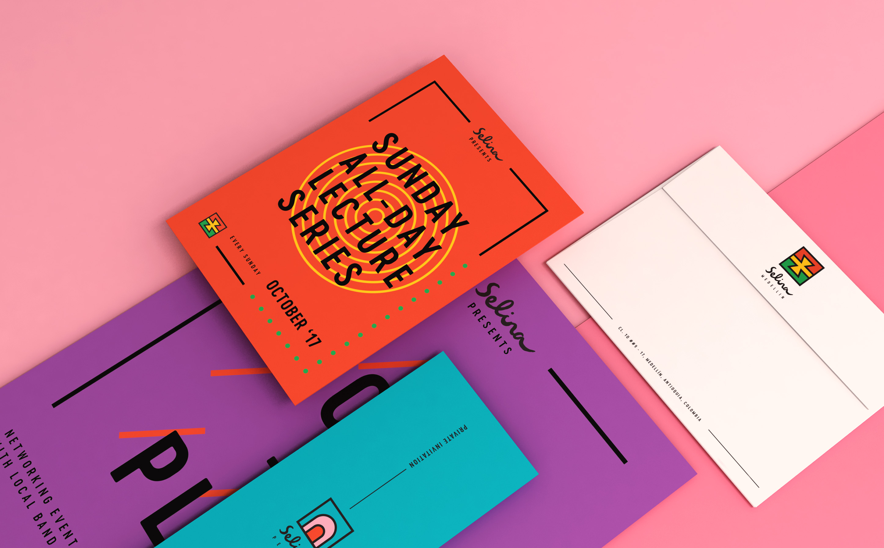
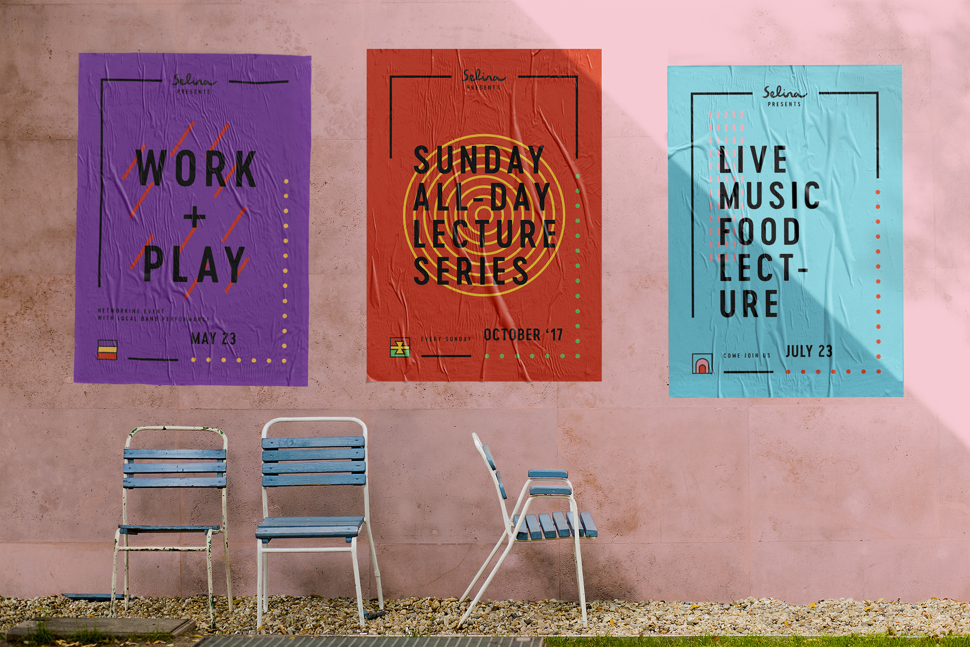
Selina’s identity was built on a color palette of black and white – two colors that act as the base for everything, glorifying the connectedness of Selina’s entire network. For each sub-brand, we added chroma-happy color tones with respect to the colors of region-specific weavings and textiles.

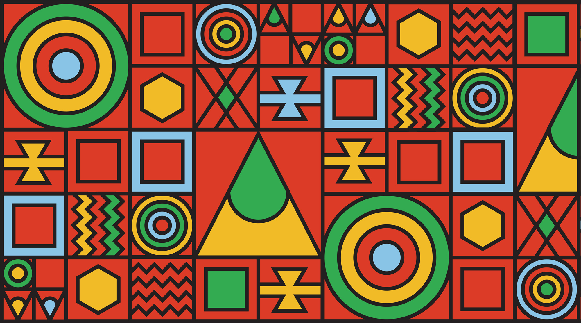

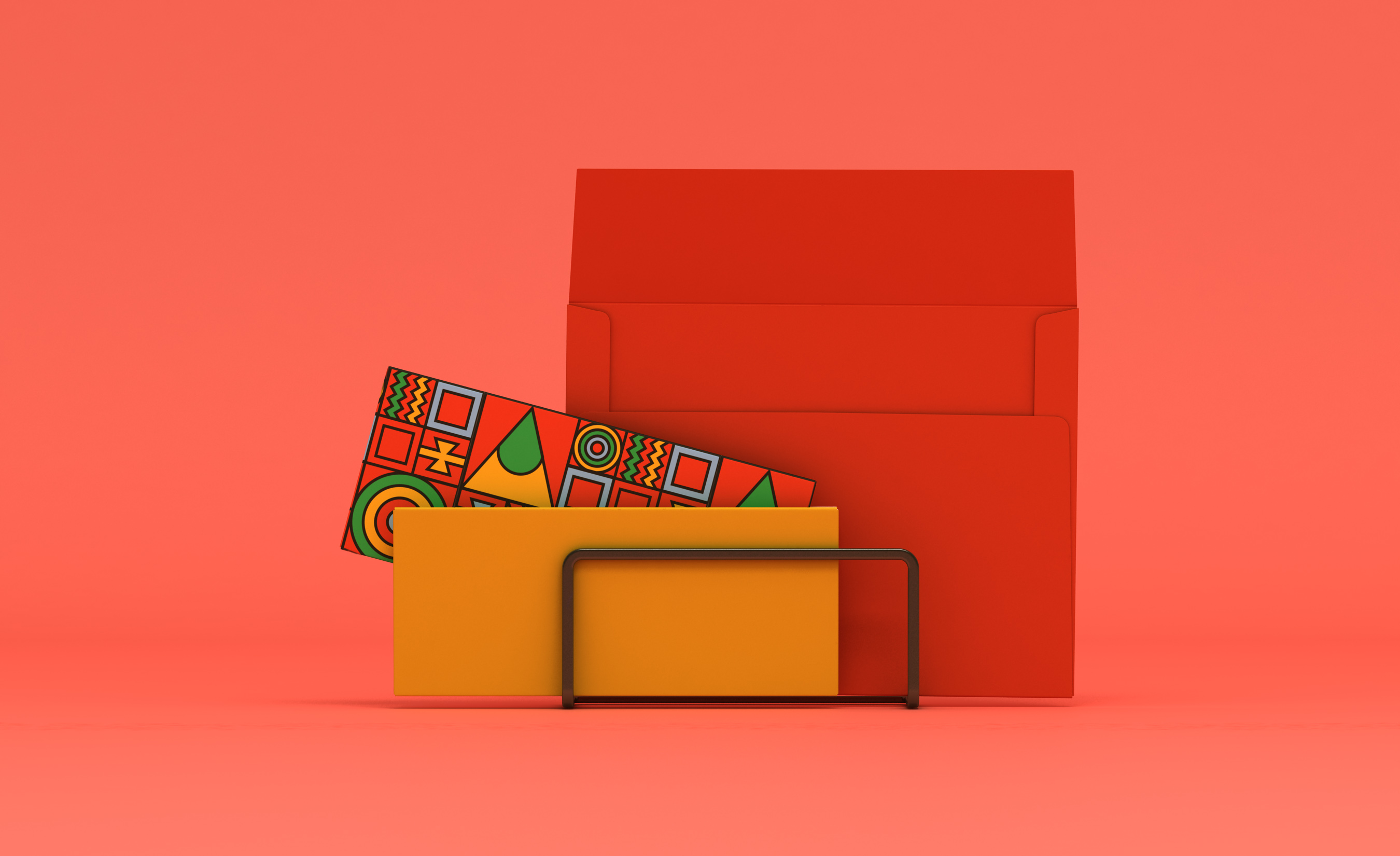
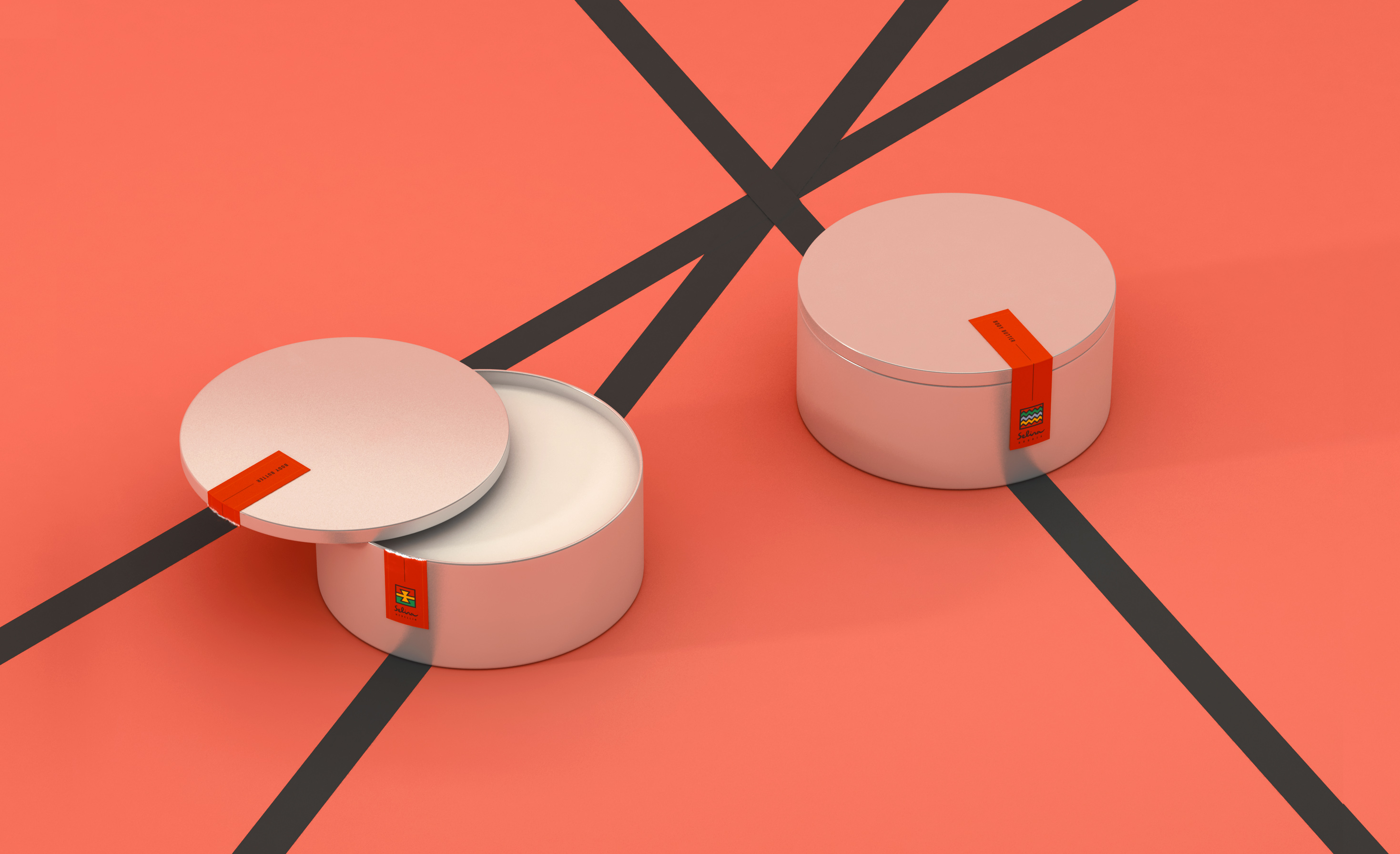

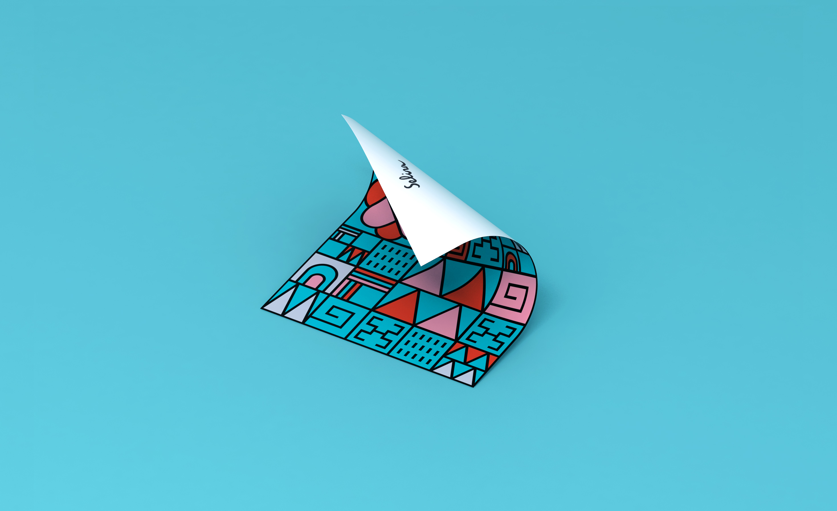
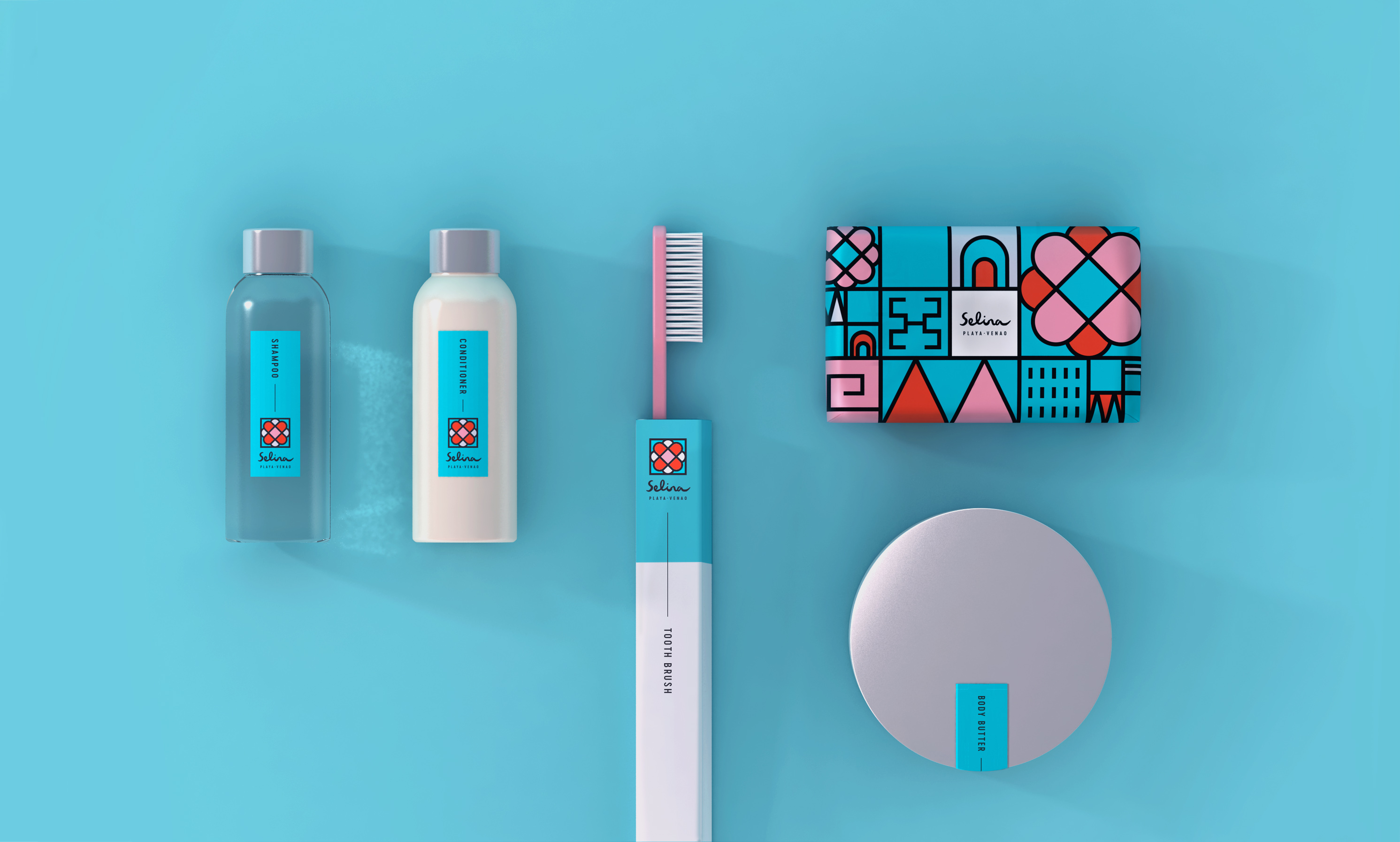


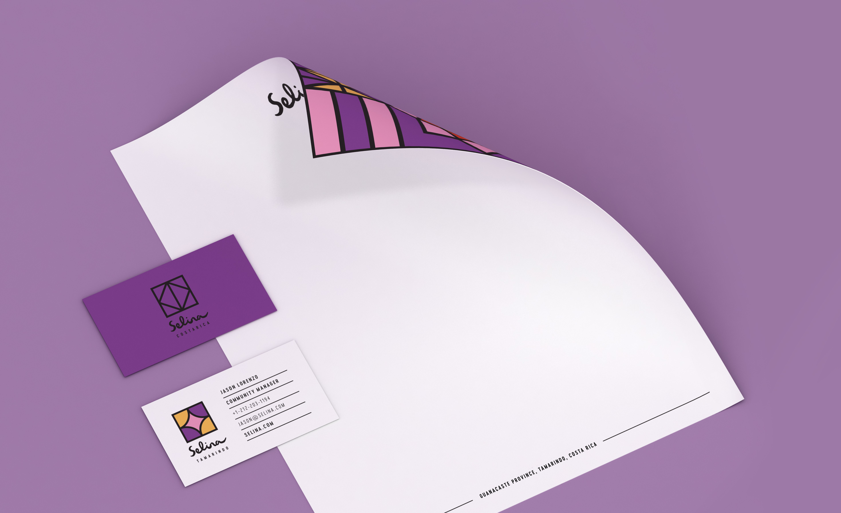
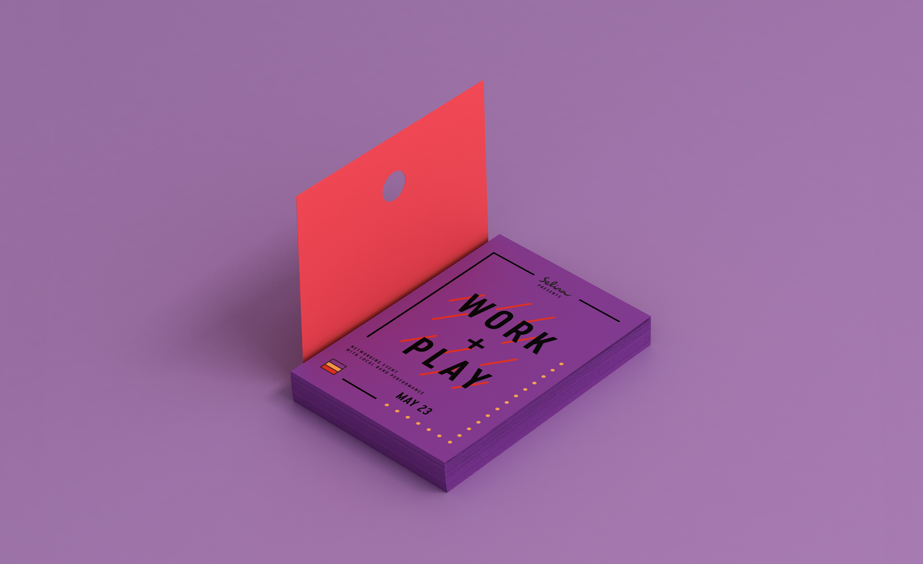
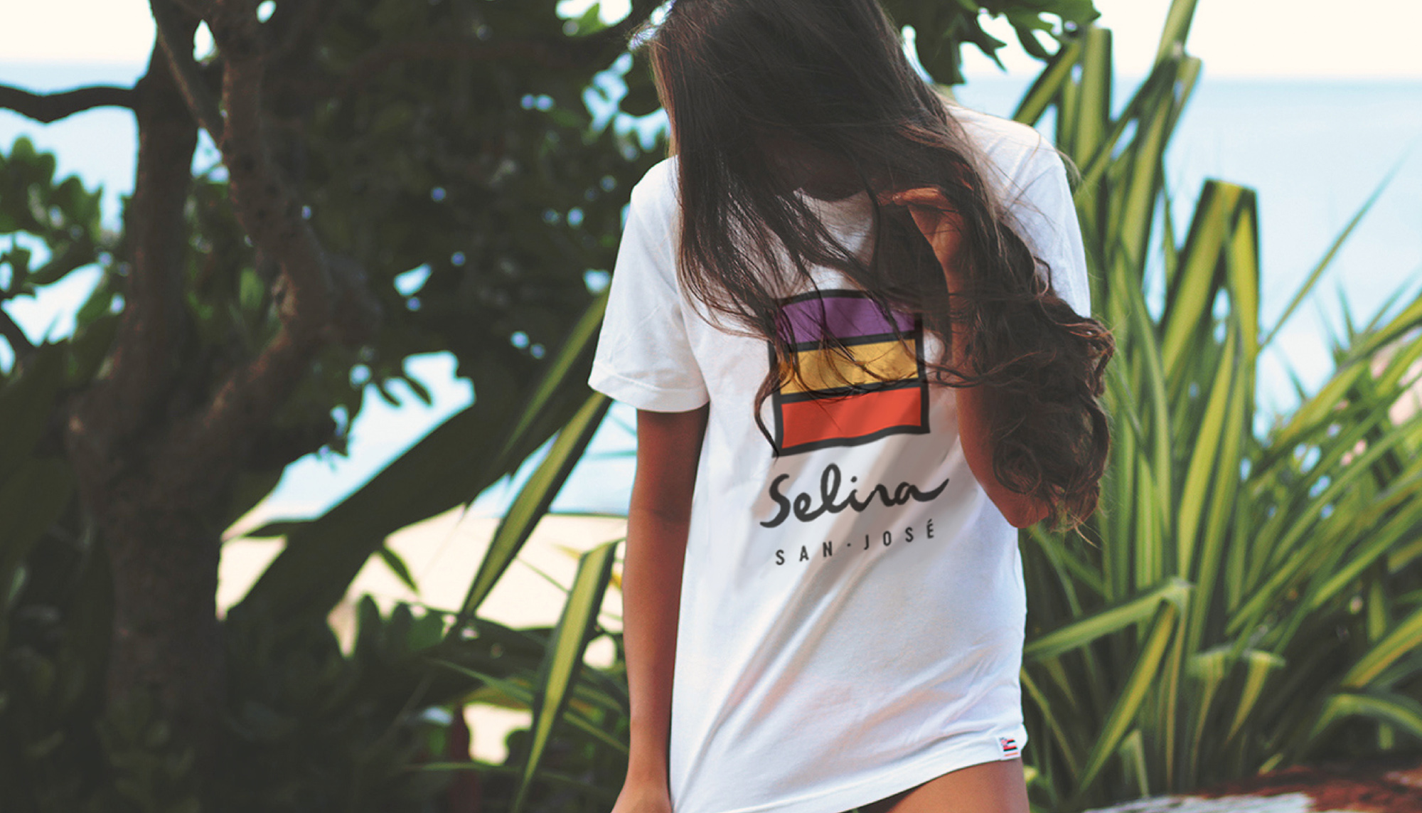
This mix of high pigment colors and layered patterns was then applied to a wide range of marketing assets, including everything from swimsuits and surfboards to stationery and posters to toiletries, towels, gift boxes and t-shirts. Selina is now equipped with materials that not only elevate their brand, but cater to curious travelers with an open mind, an adventurous spirit and an appreciation of Latin American traditions.
Thanks! You have been successfully added to our mailing list. Expect a confirmation e-mail shortly.
Sorry, we weren't able to sign you up. Please check your details, and try again.
We will be in touch with you shortly.
