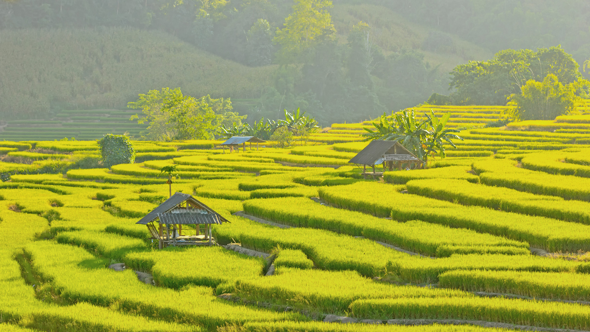
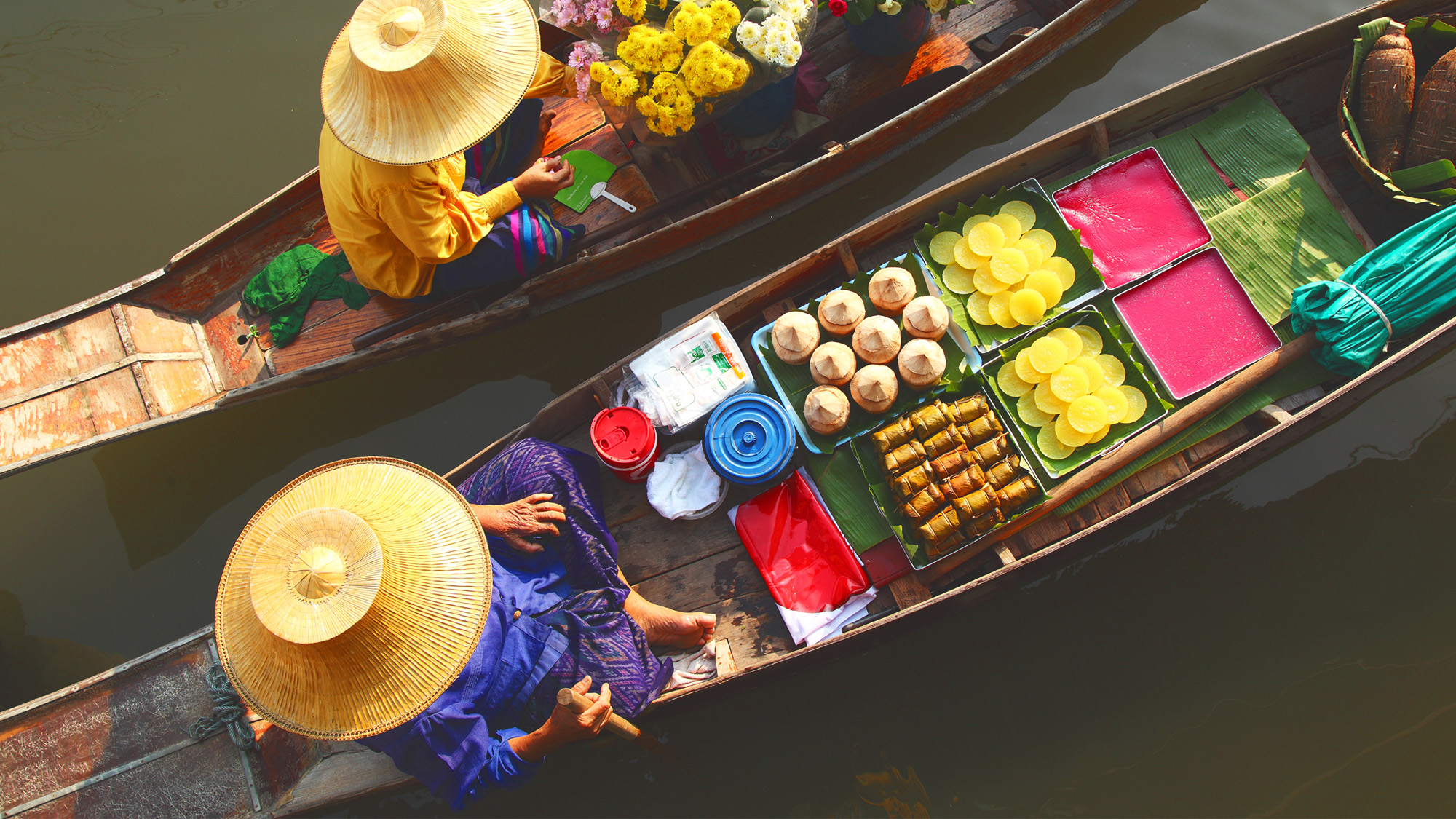
Wangderm has been a leading manufacturer of Thai and ethnic food commodities for over 25 years. After becoming a massive success in their native land, the founder and his closest relatives decided to try their luck in New York, making Wangderm one of the first authentic Thai food brands to expand into the American market. With the help of Squat New York, they set out to rebuild and reposition their brand to better capture the interest of mainstream America and large Asian markets alike. This could only be done with a vibrant brand character encapsulating all the mythical stories and authentic flavors of their Thai heritage.
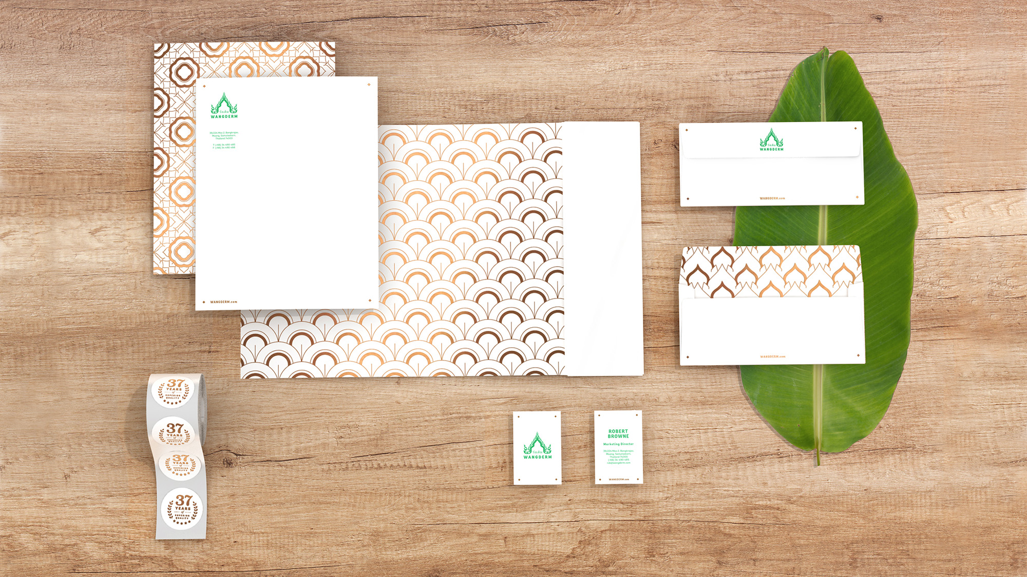
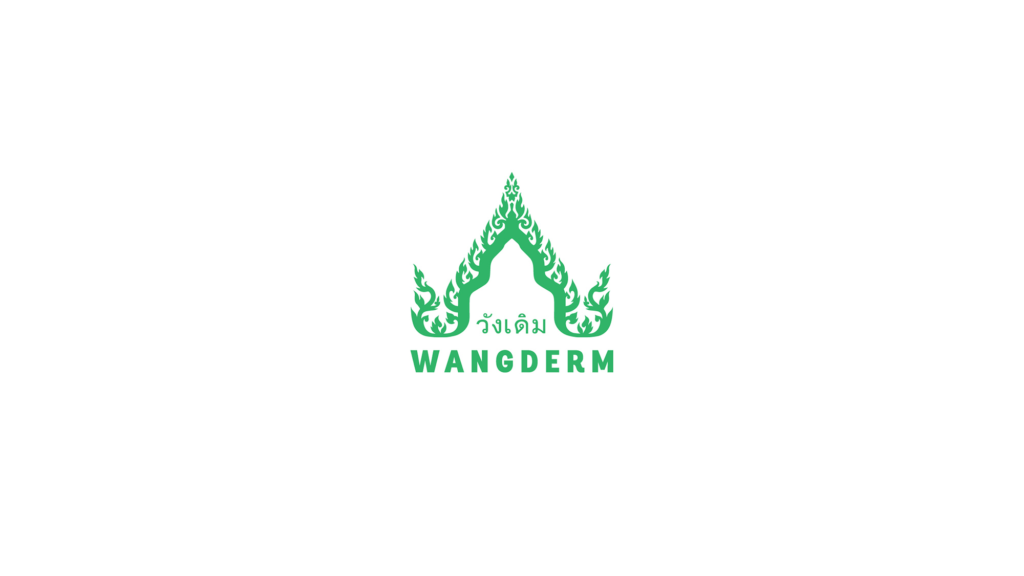
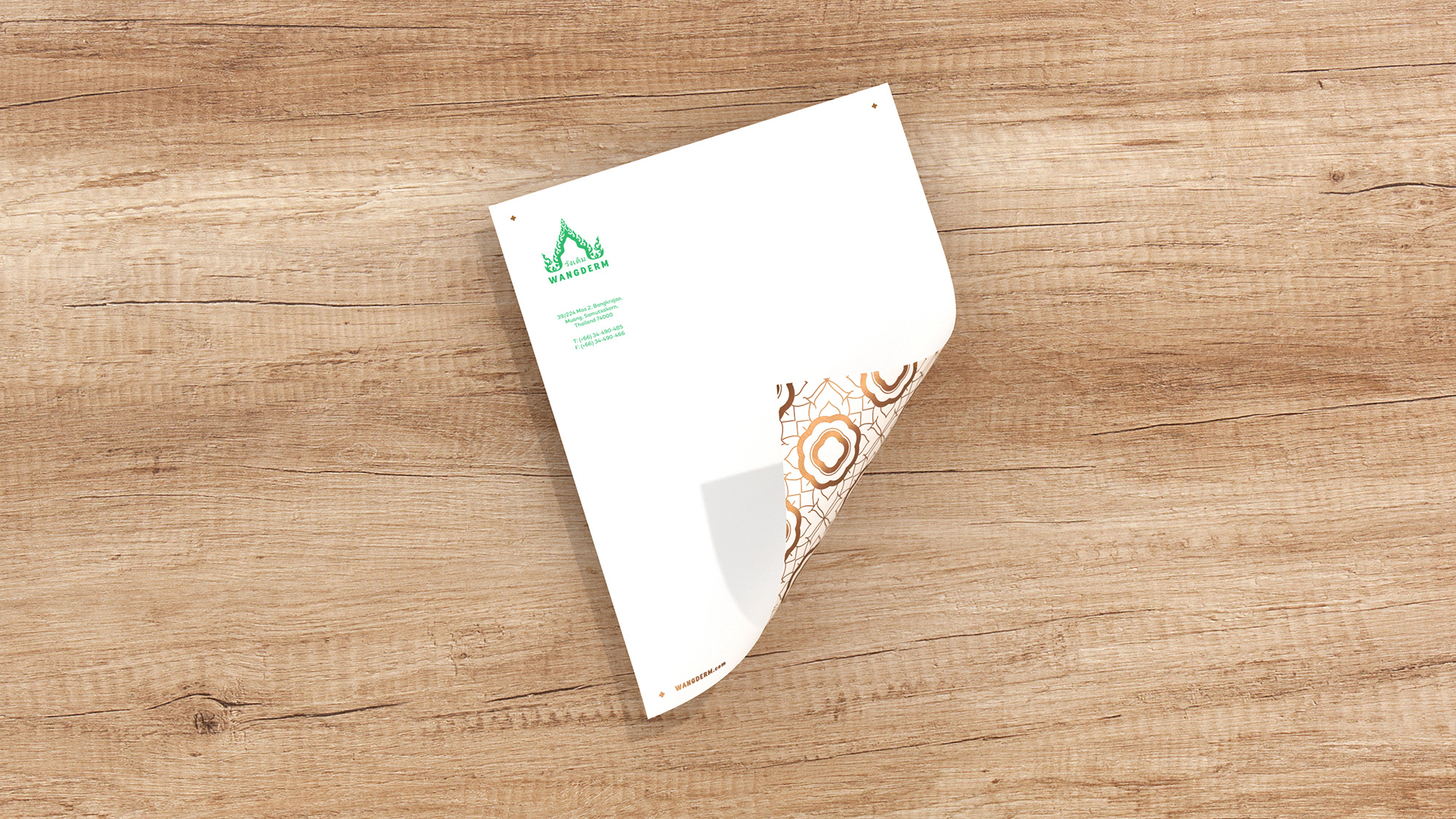
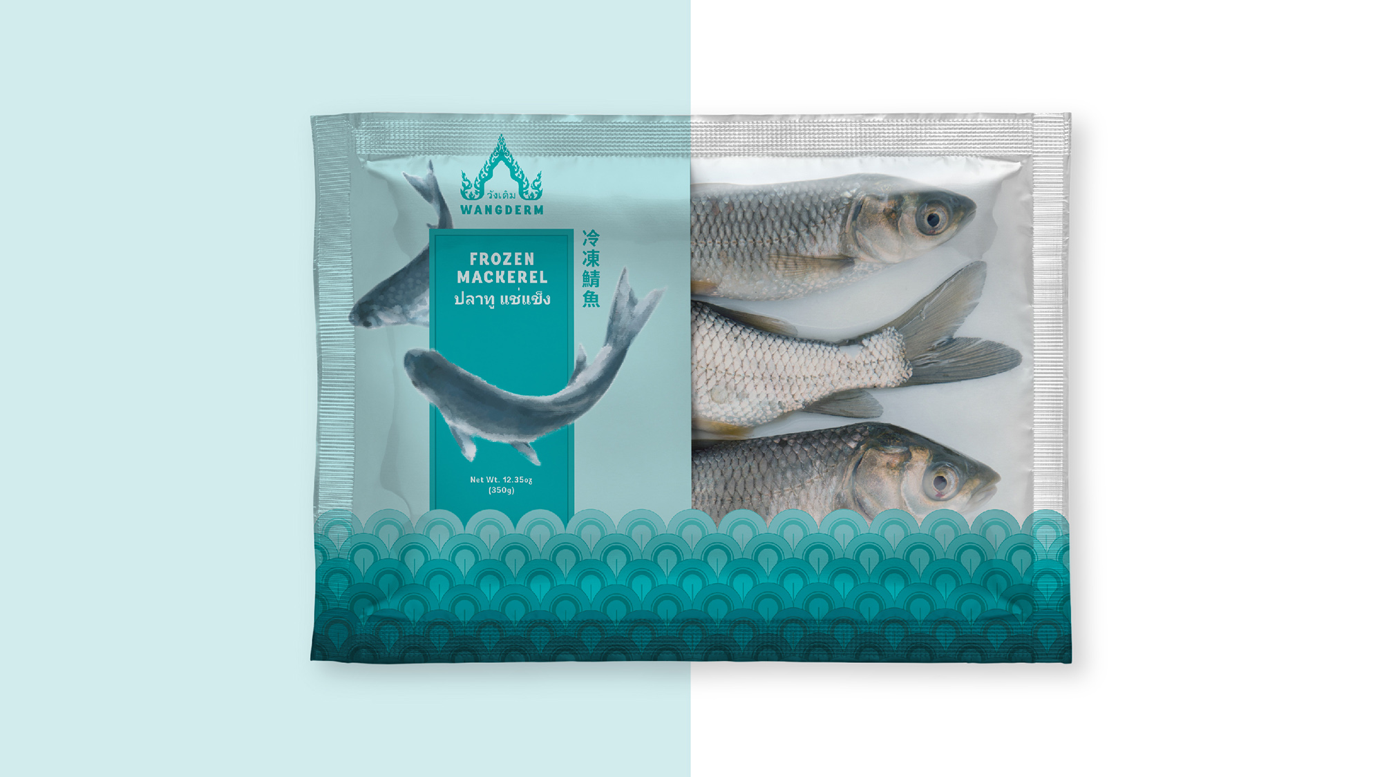
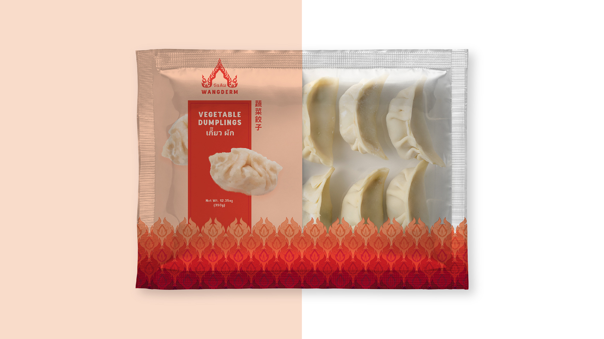
Brand reconfiguration began with redesigning their logo – formerly a very intricate representation of the Thai “Old Palace” temple rooftop. While we retained the concept of the rooftop, a symbol of high quality and respect, we crafted a simplified, hand-drawn version that is more easily recognized in a smaller size. We even lightened the original dark green to a fresher, brighter green.
Wangderm also needed a tagline that accurately conveyed the authenticity of their products – all sourced directly from Thailand. Nothing says that better than “A true Thai kitchen.”
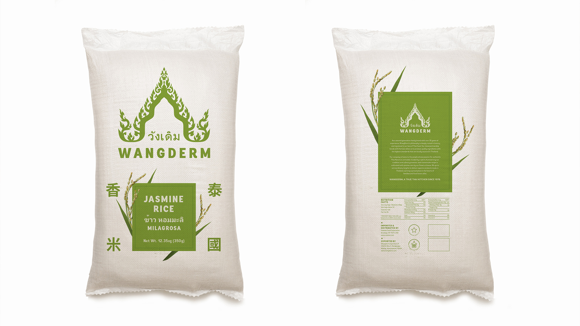
We designed the packaging for over 60 different products – from canned and boxed food items to dry foods enclosed in pouches to bottled drinks. It was important that the packaging for each type of food sat well on its own, and yet harmonized with all of Wangderm’s other products.
Unifying the designs required a common theme, beginning with the assembly of a cohesive set of colors. We completely reimagined Wangderm’s color palette, trading in some of reds, greens, and golds traditionally used in Thai packaging for the punchy pinks, blues and purples of Thai fabrics and flowers. These saturated hues helped leveraged the company’s Thai heritage, adding energy and cultural significance.
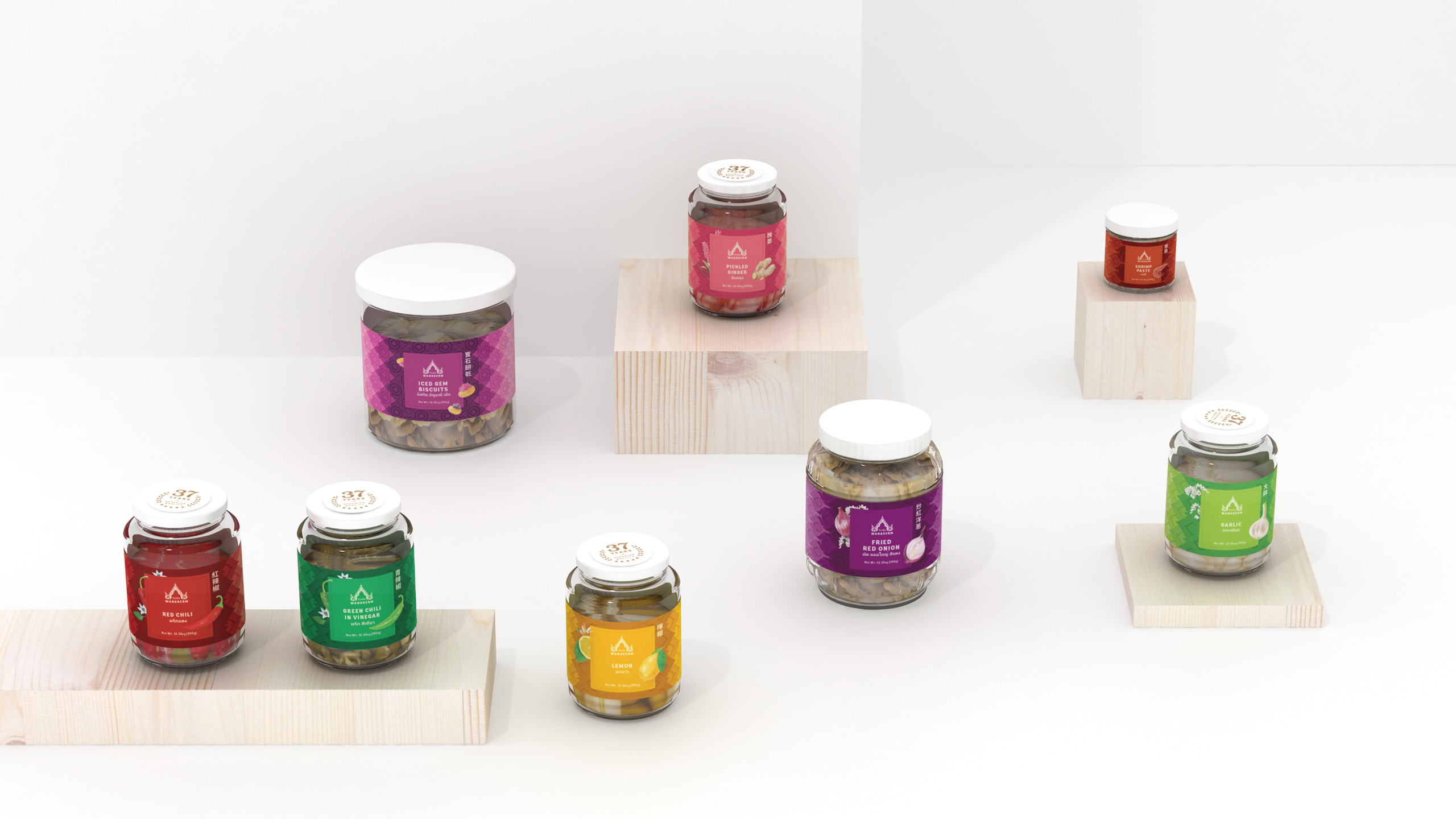
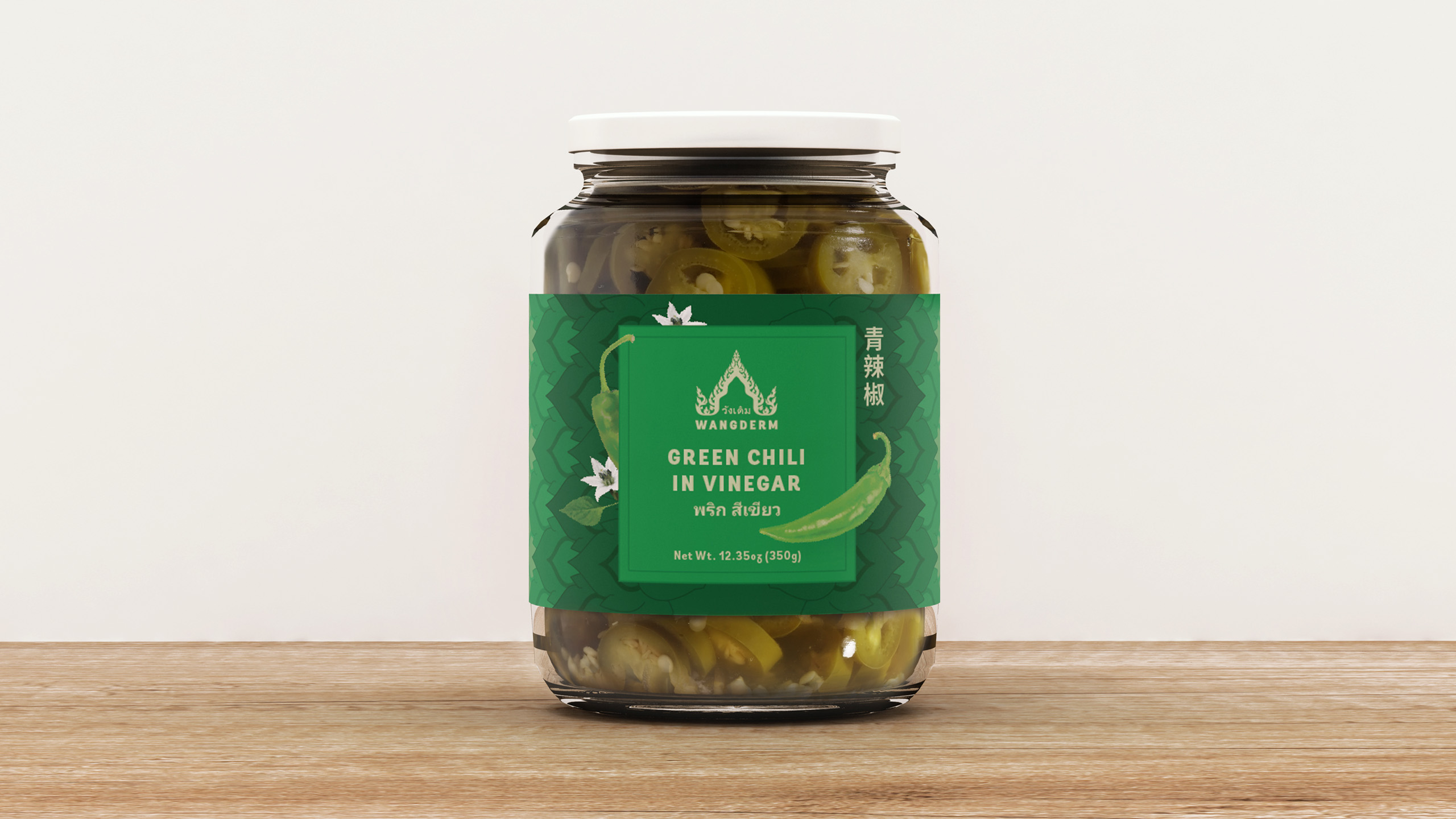
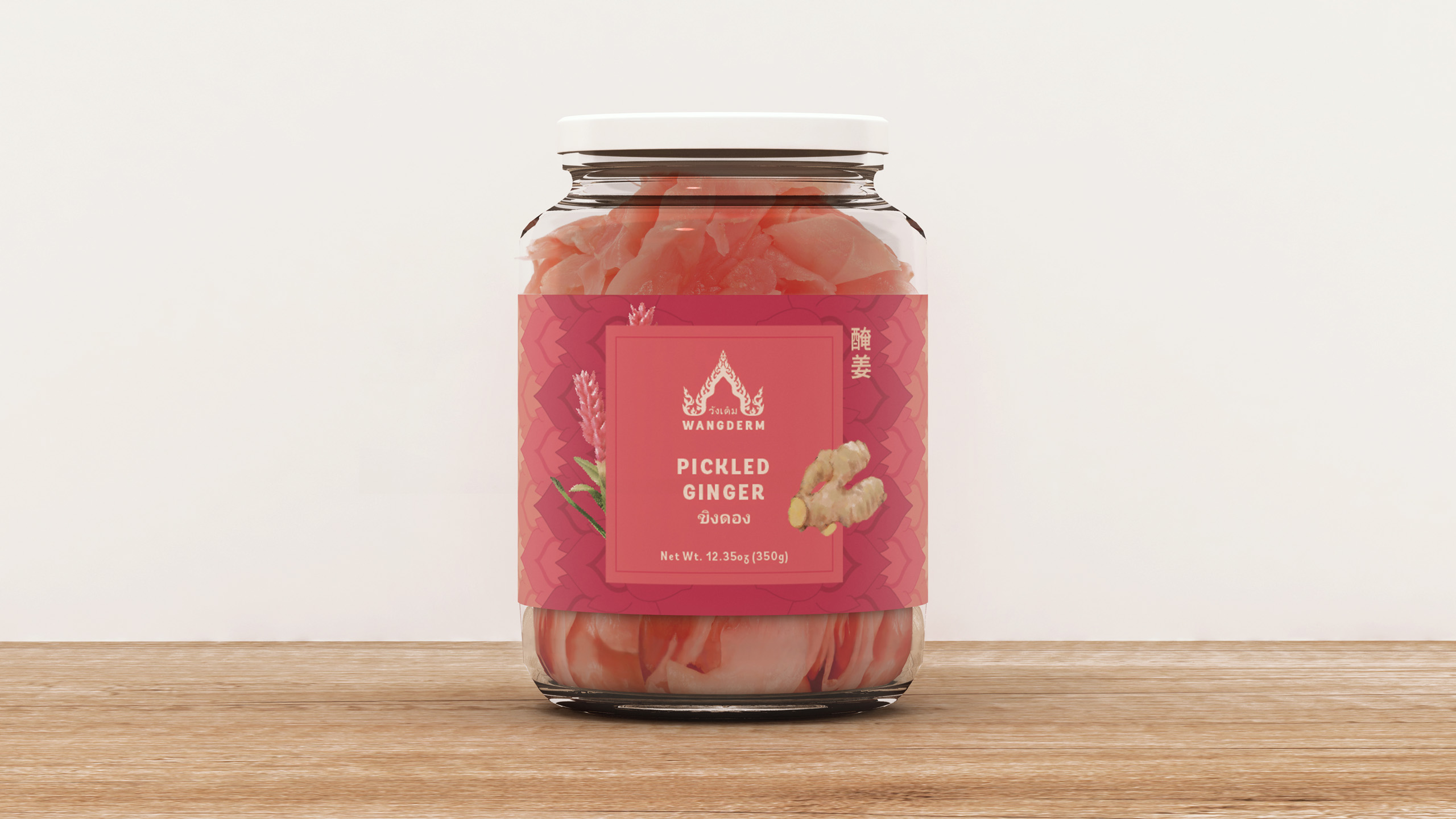
The theme also included a set of oriental illustrations and patterns, all based on characters rooted in Thai spirituality and mythology, such as Naga Chofa and Garuda. Naga is a golden serpent frequently carved into the rooftops of temples and palaces. Chofa, meaning “sky tassel,” is also commonly featured in Thai architecture. It is a decorative wing strongly associated with Garuda – the half man, half bird creature considered to be national symbol of Thailand. Incorporating these mythological beings imbued the brand with a more mystical quality.

The resulting design is a harmonic blend of tradition, cross-cultural values and a modern sense of vitality. The products in all their colorful glory practically call out to consumers from the shelves. Wangderm has since become an Asian kitchen staple in restaurants and homes across America and Asia.
Thanks! You have been successfully added to our mailing list. Expect a confirmation e-mail shortly.
Sorry, we weren't able to sign you up. Please check your details, and try again.
We will be in touch with you shortly.
